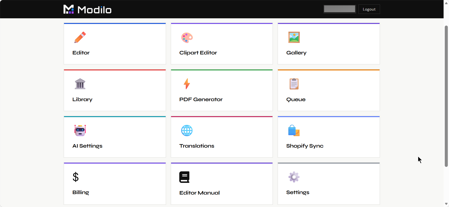
The dashboard is the merchant's control center. Each page handles a different part of the web-to-print workflow, from creating templates to connecting Shopify products and producing final files.
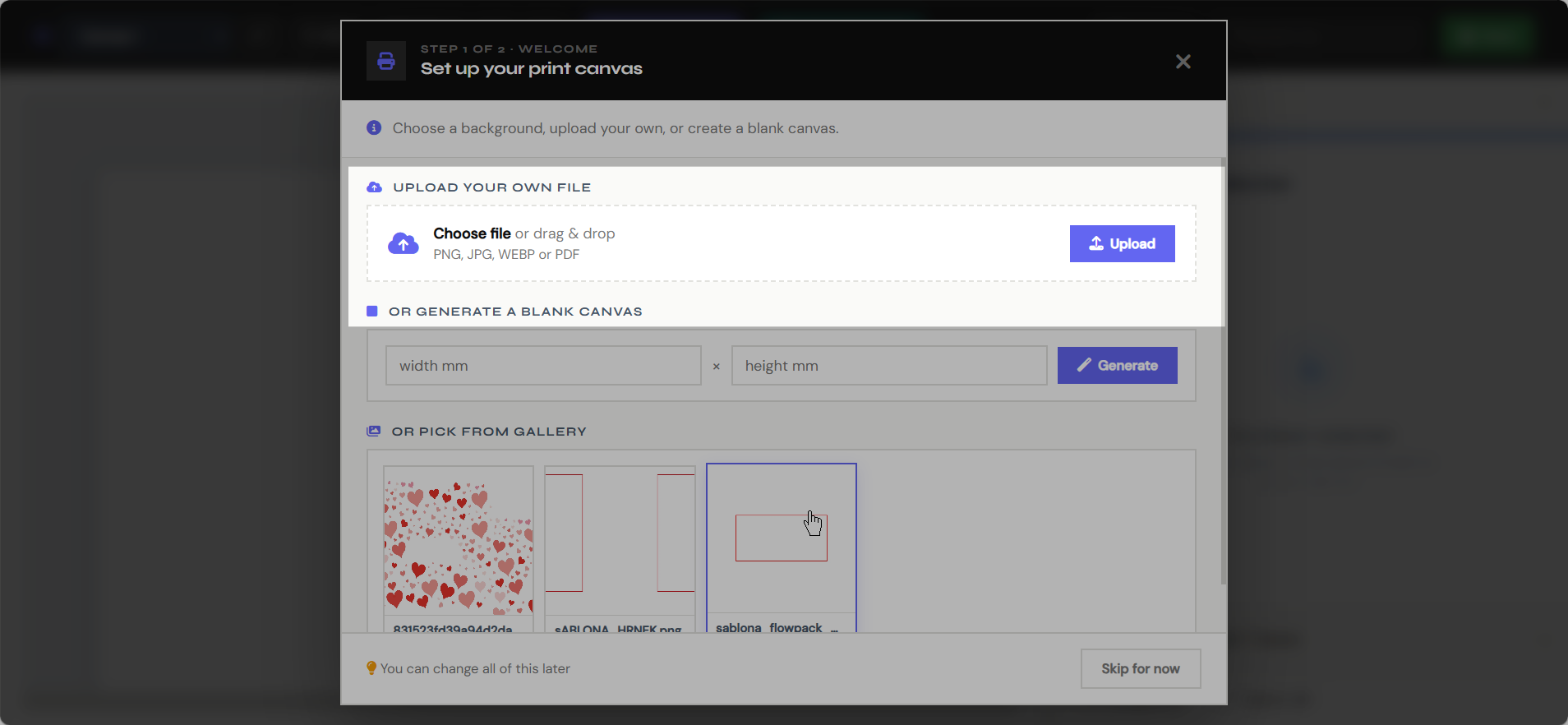
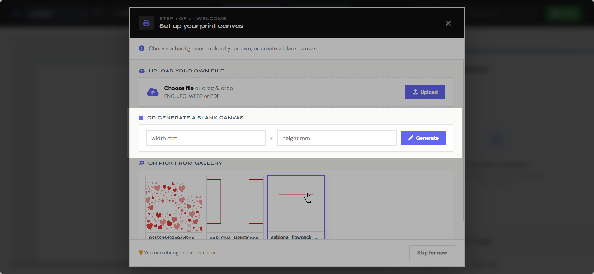
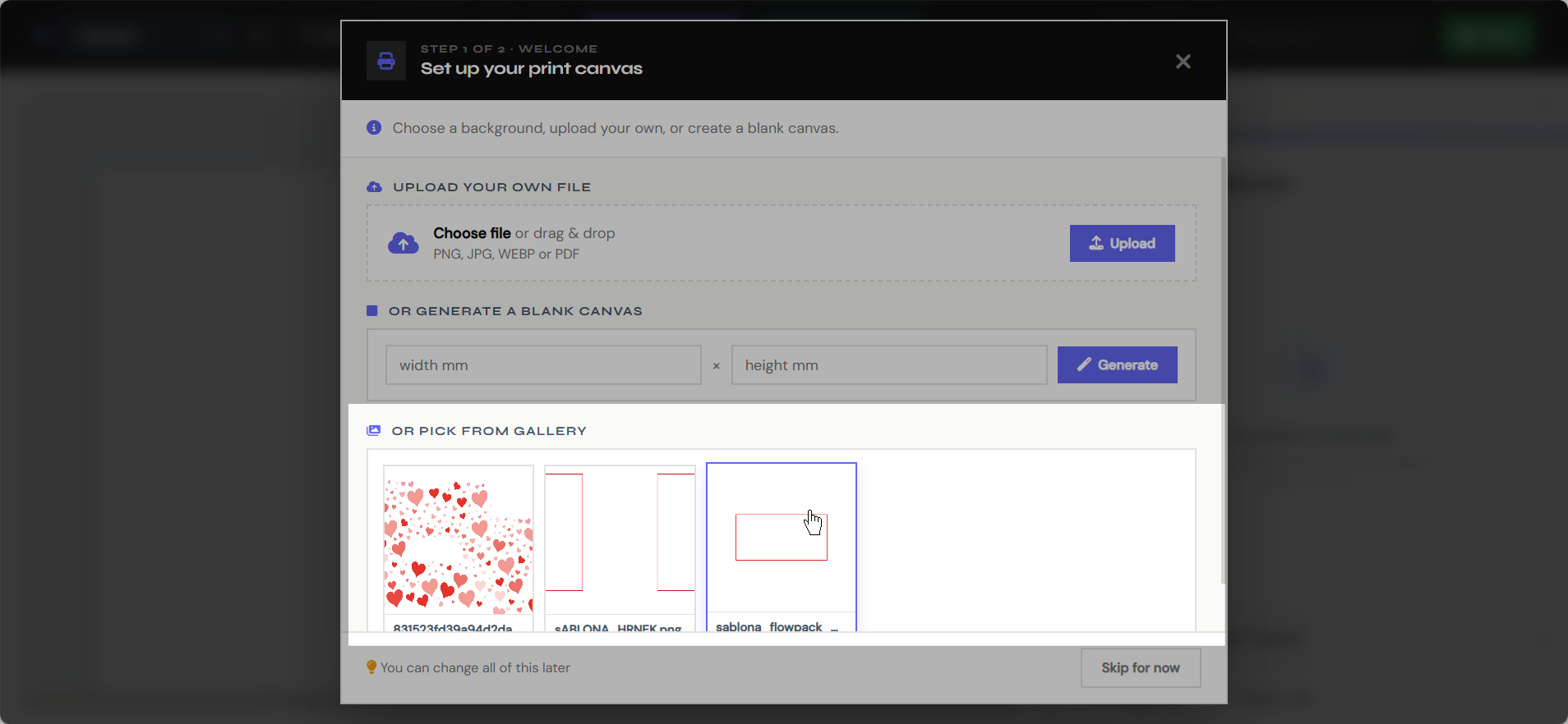
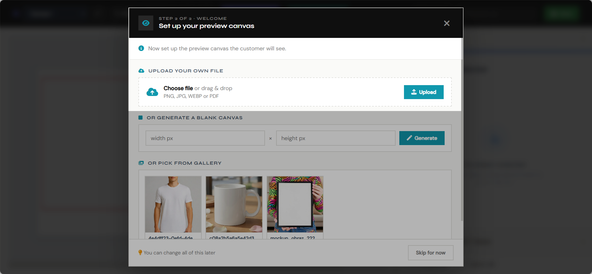
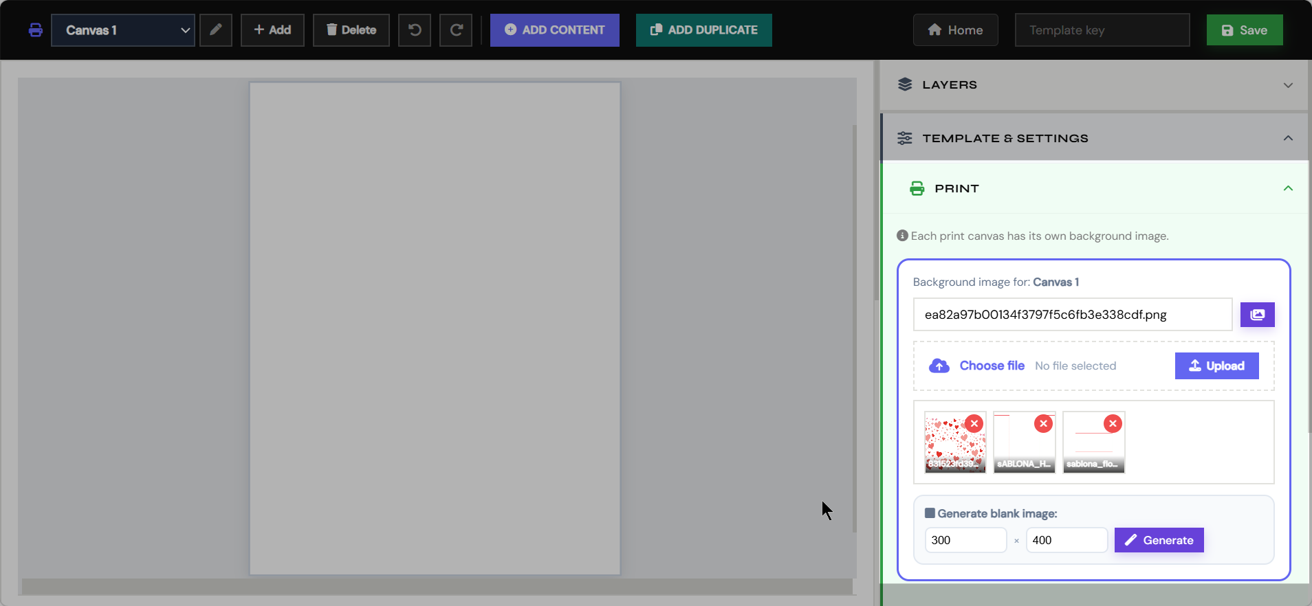
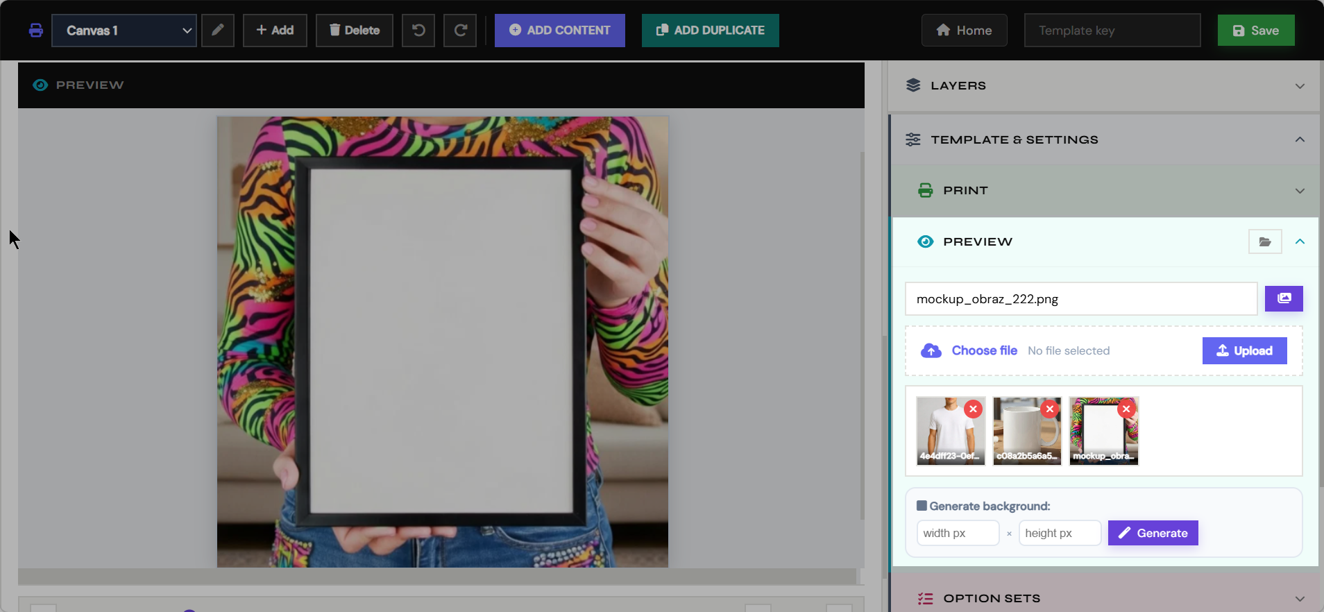
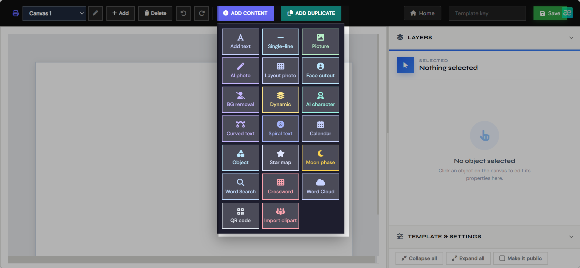
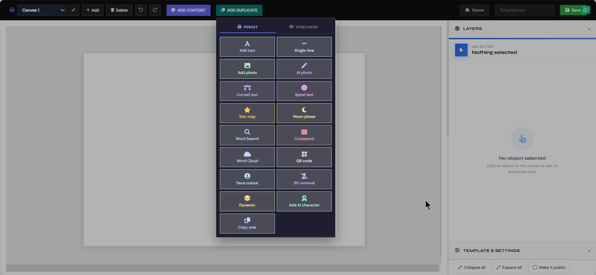
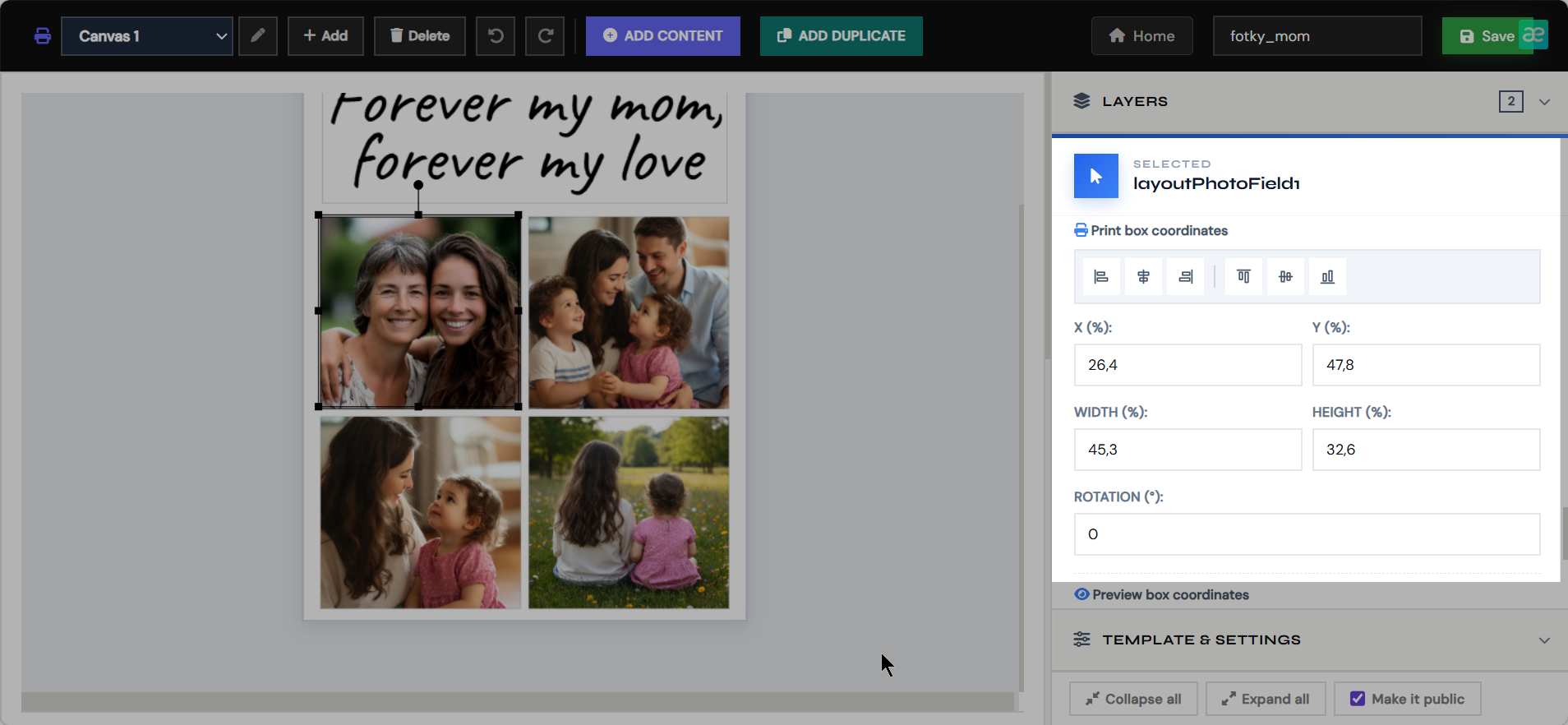
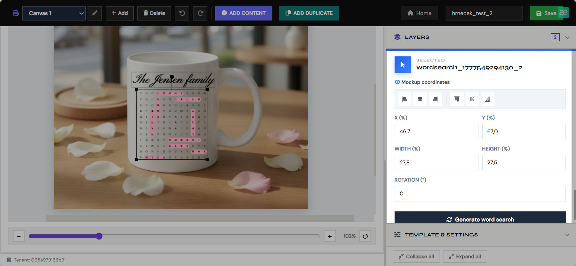
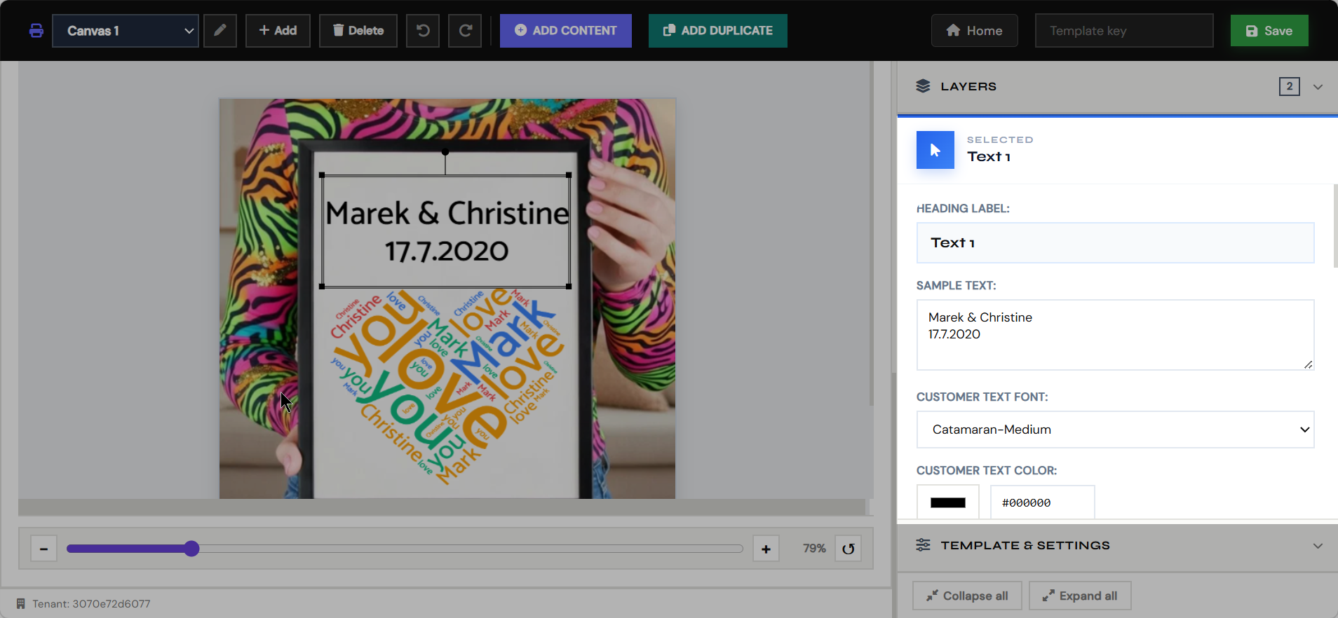
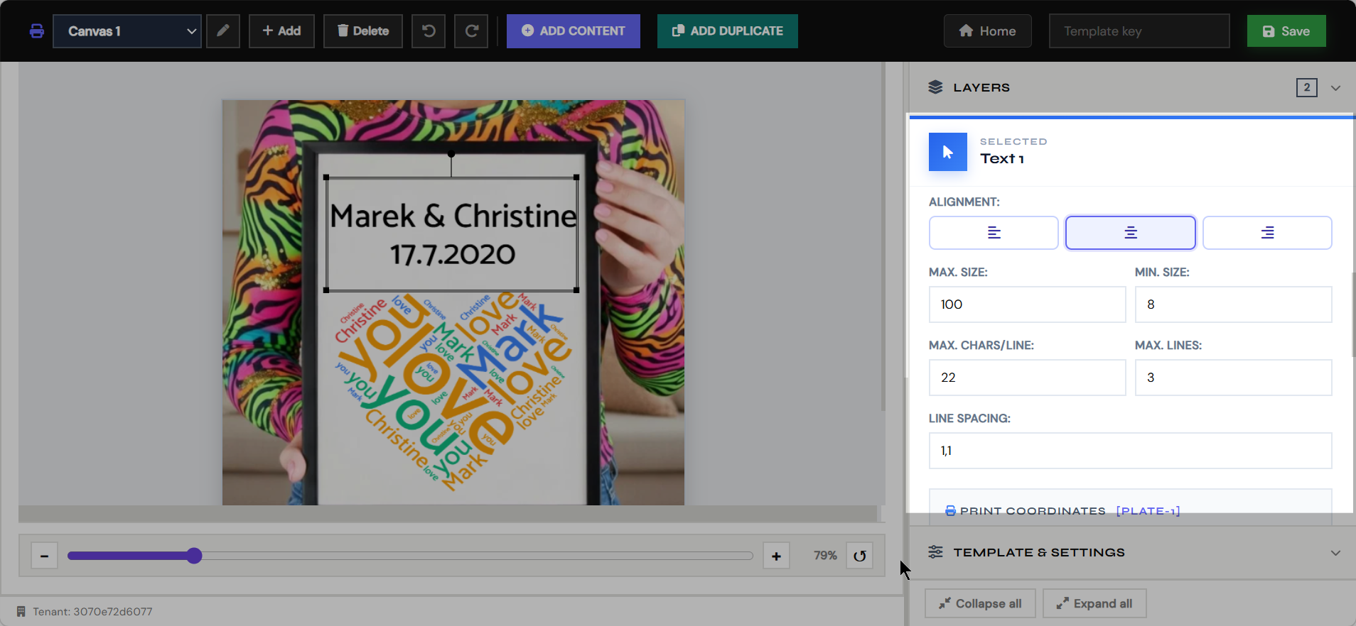
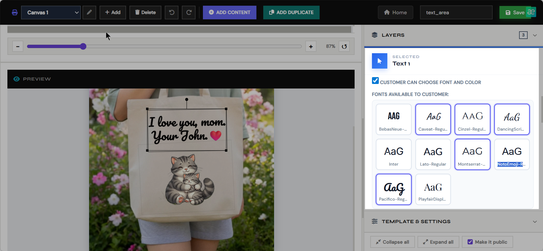
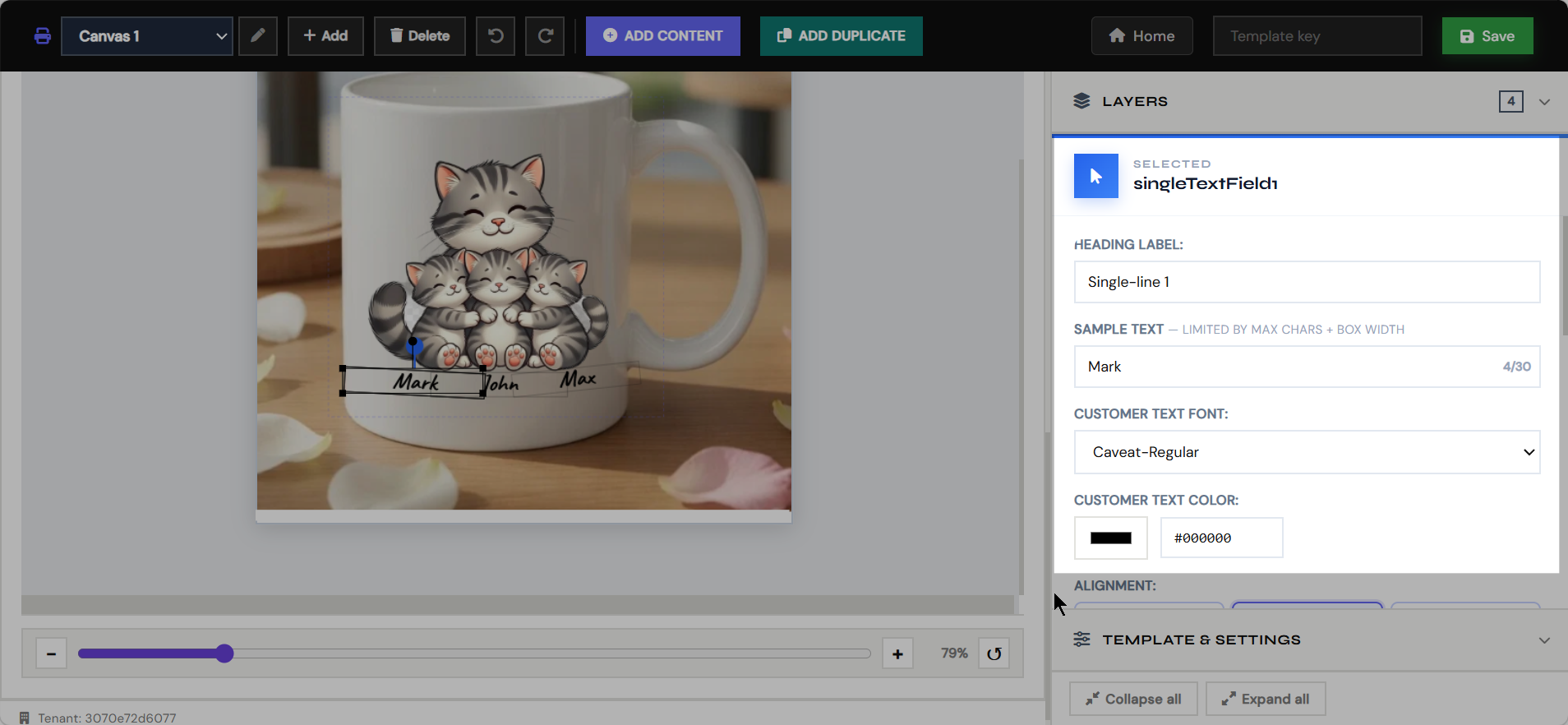
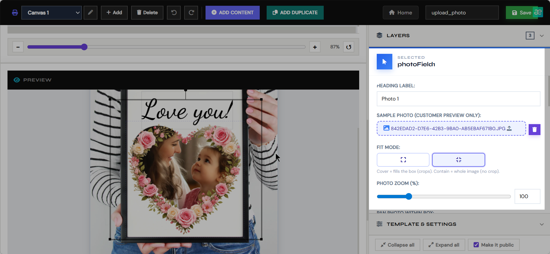
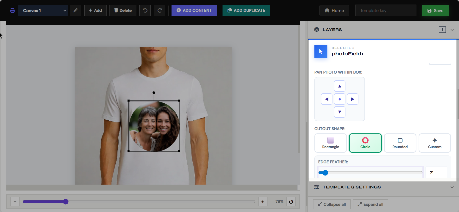
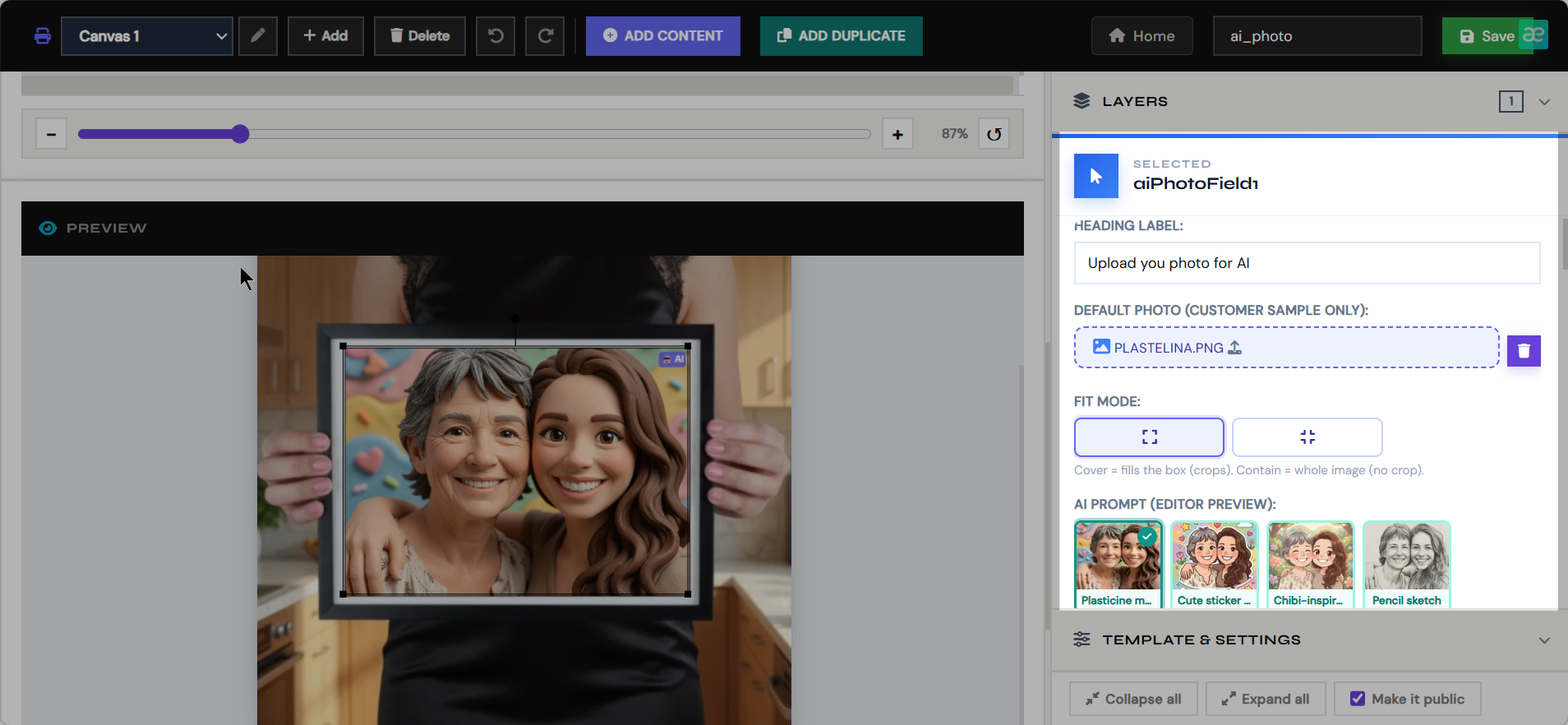
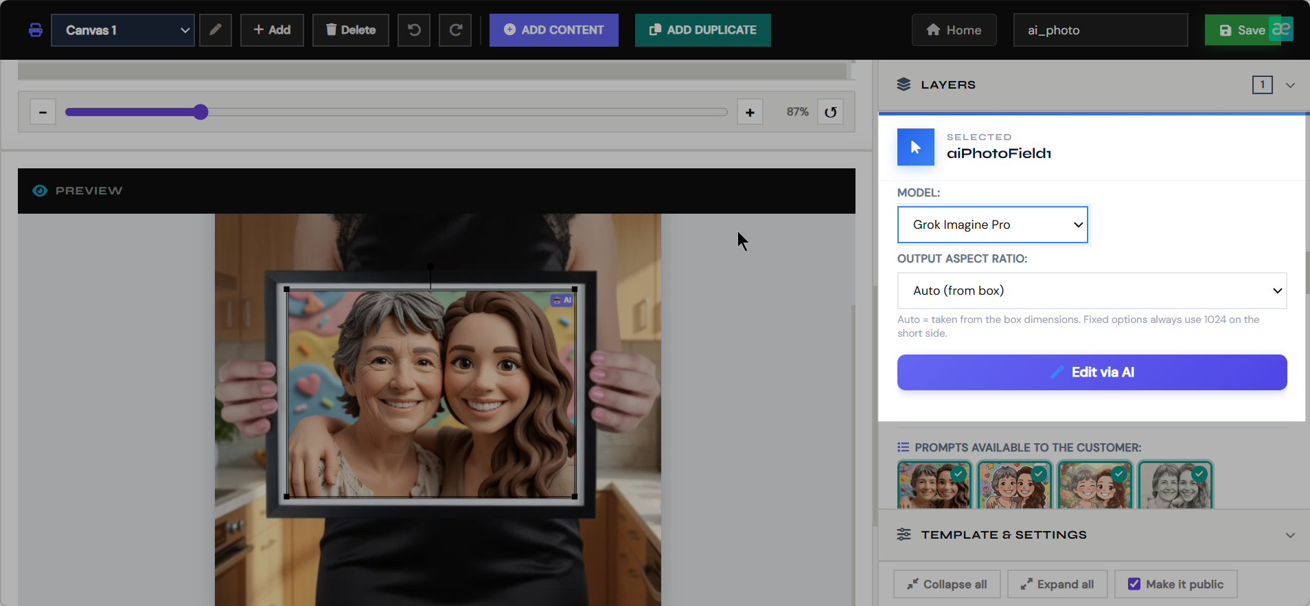
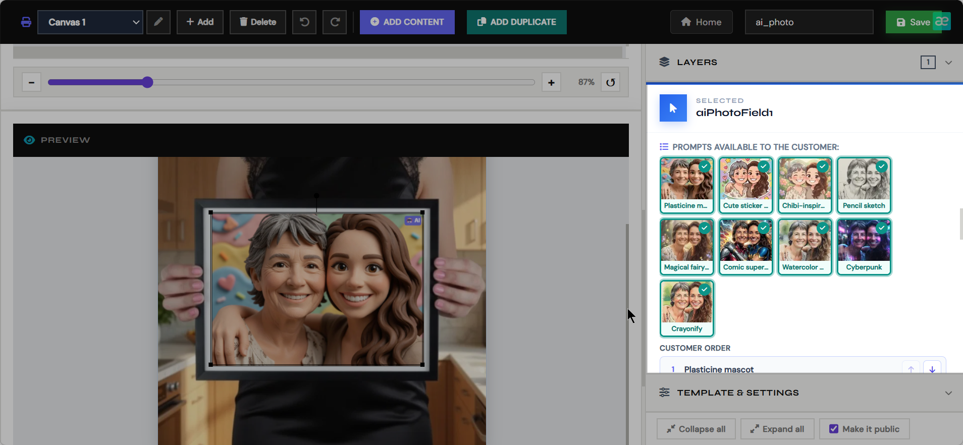
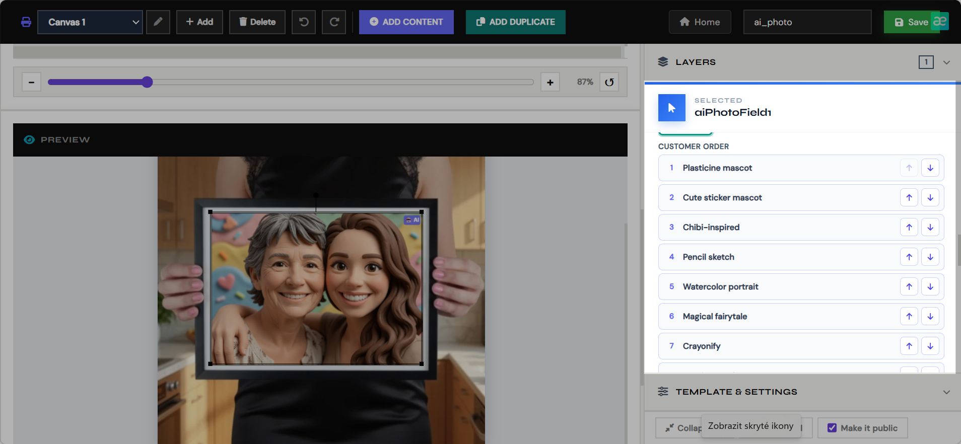
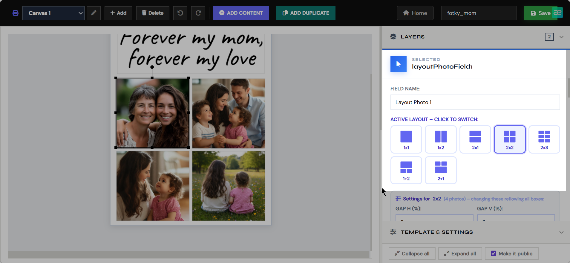
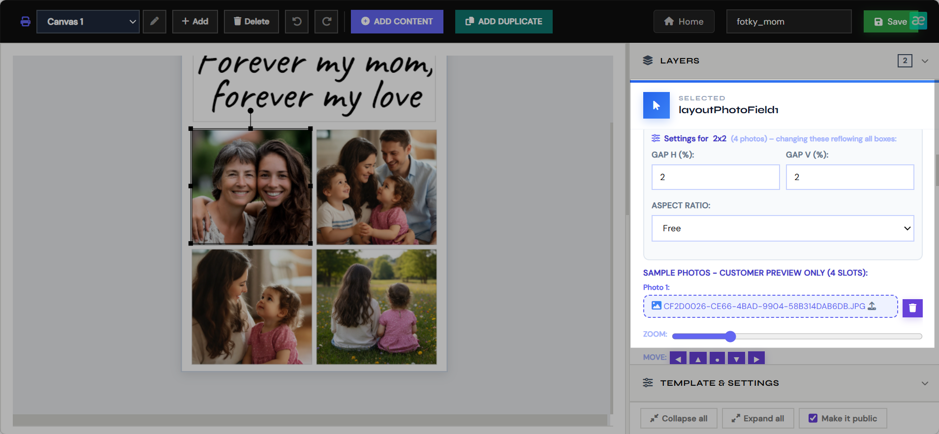
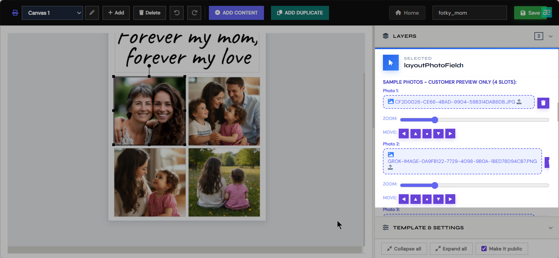
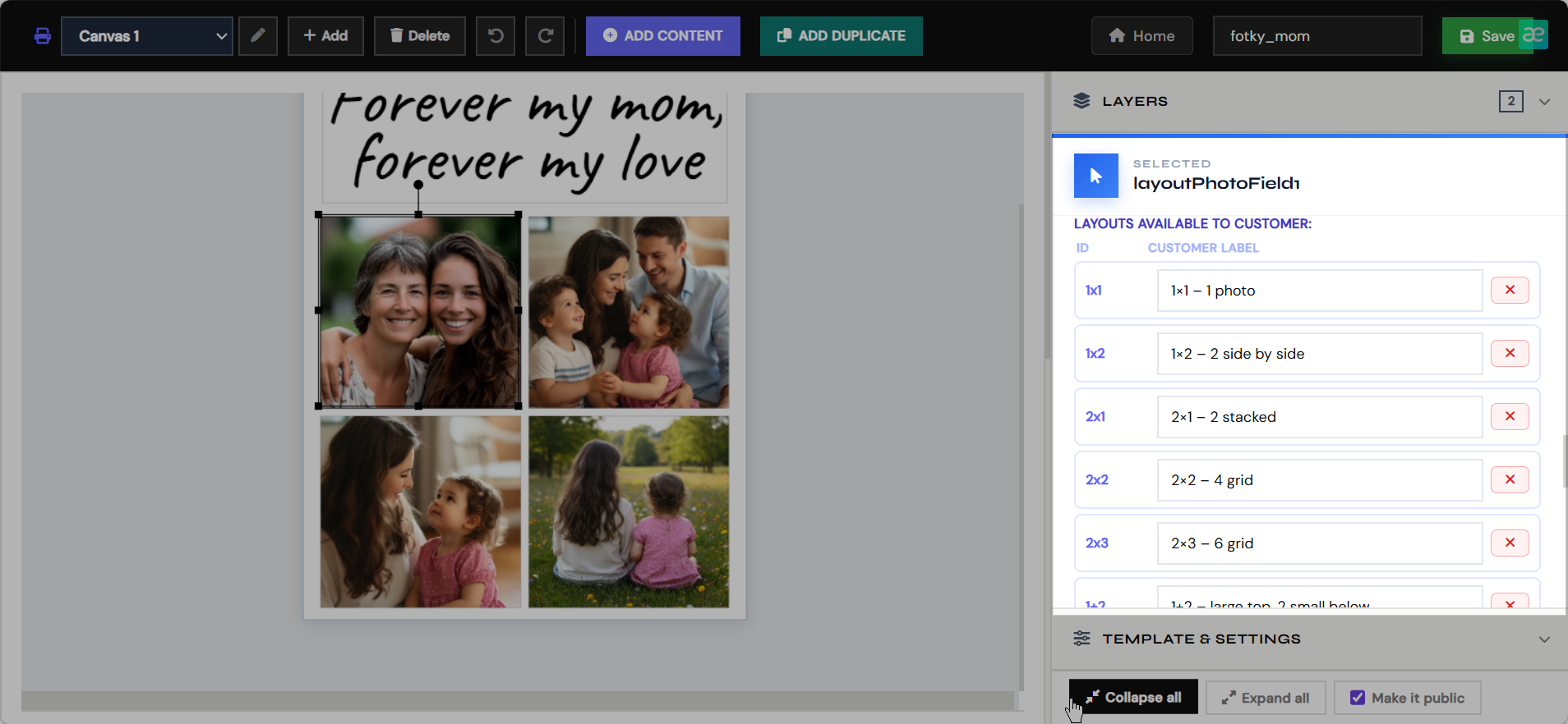
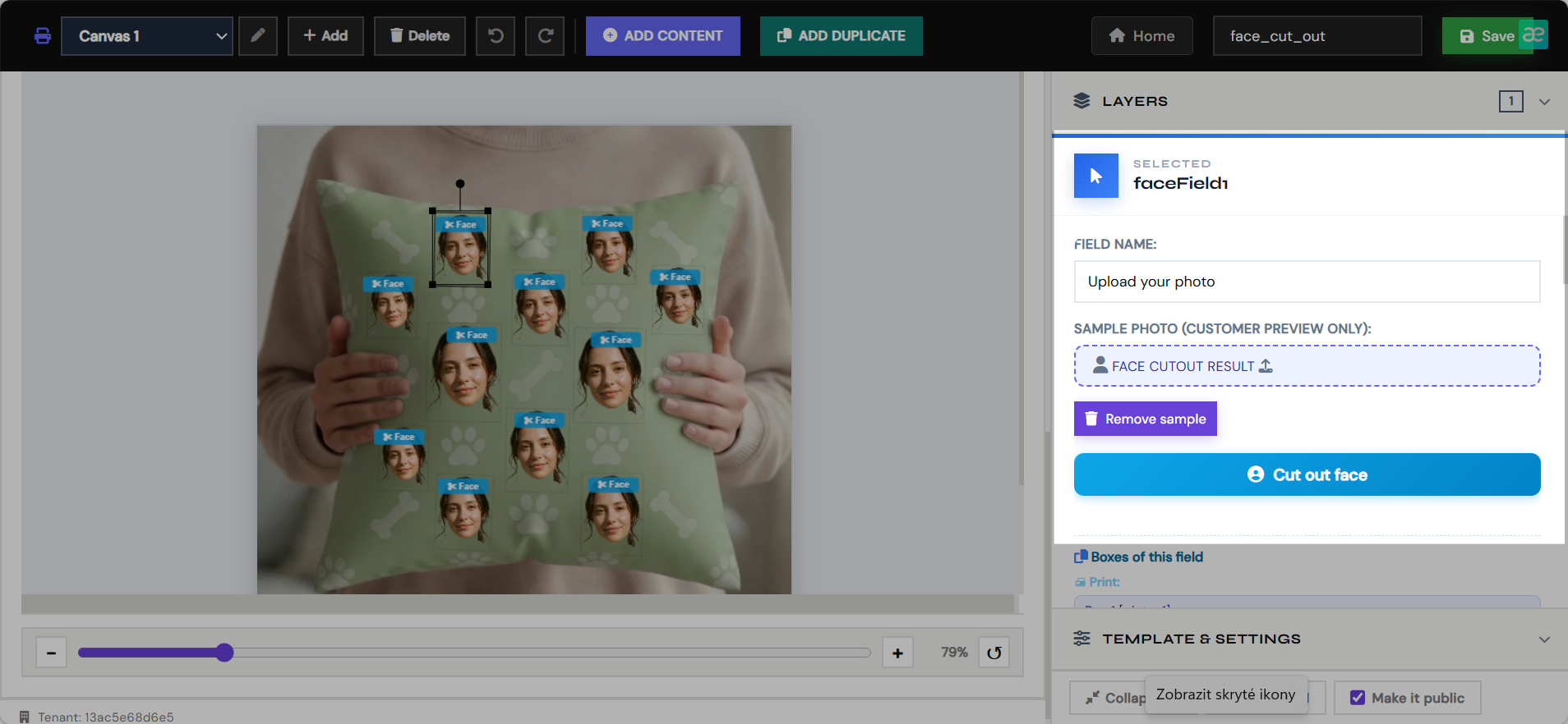
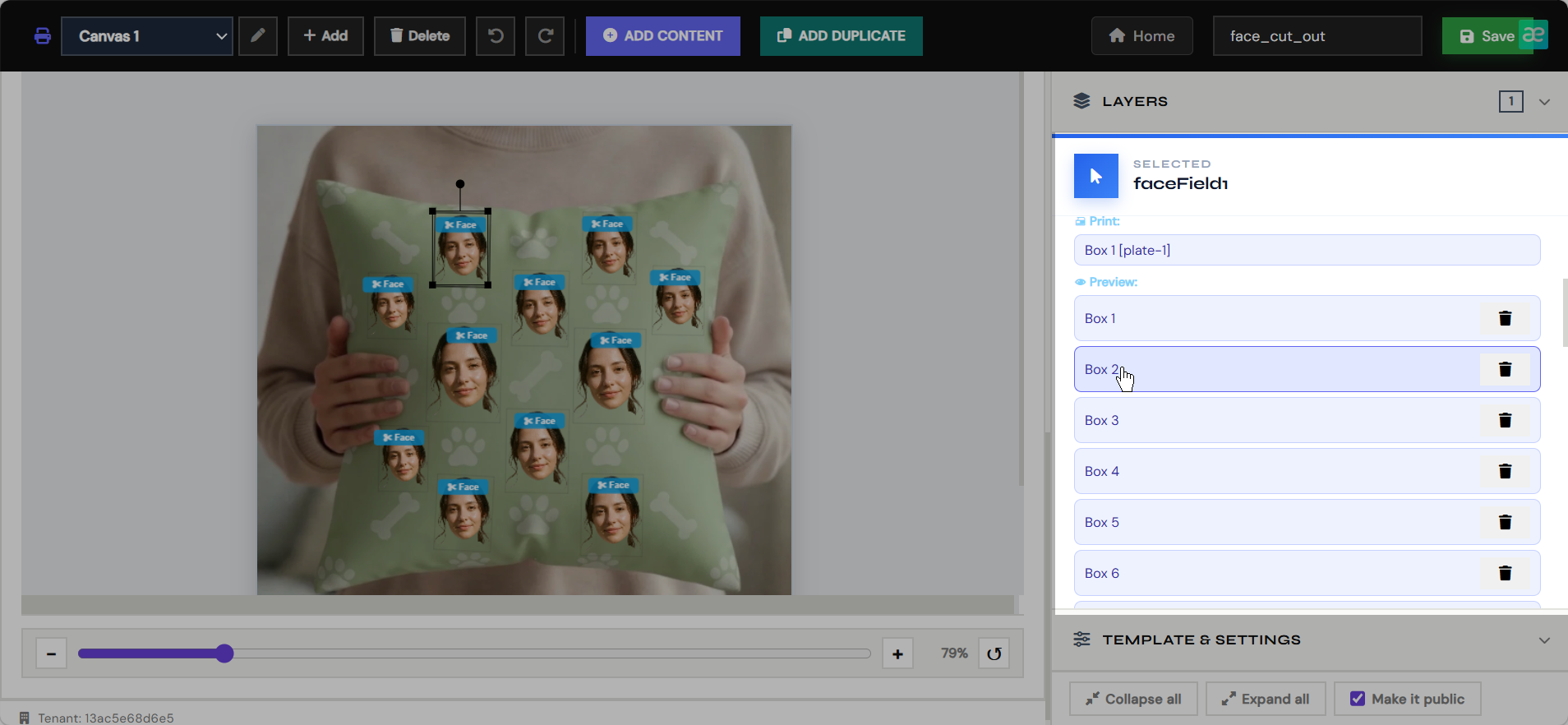
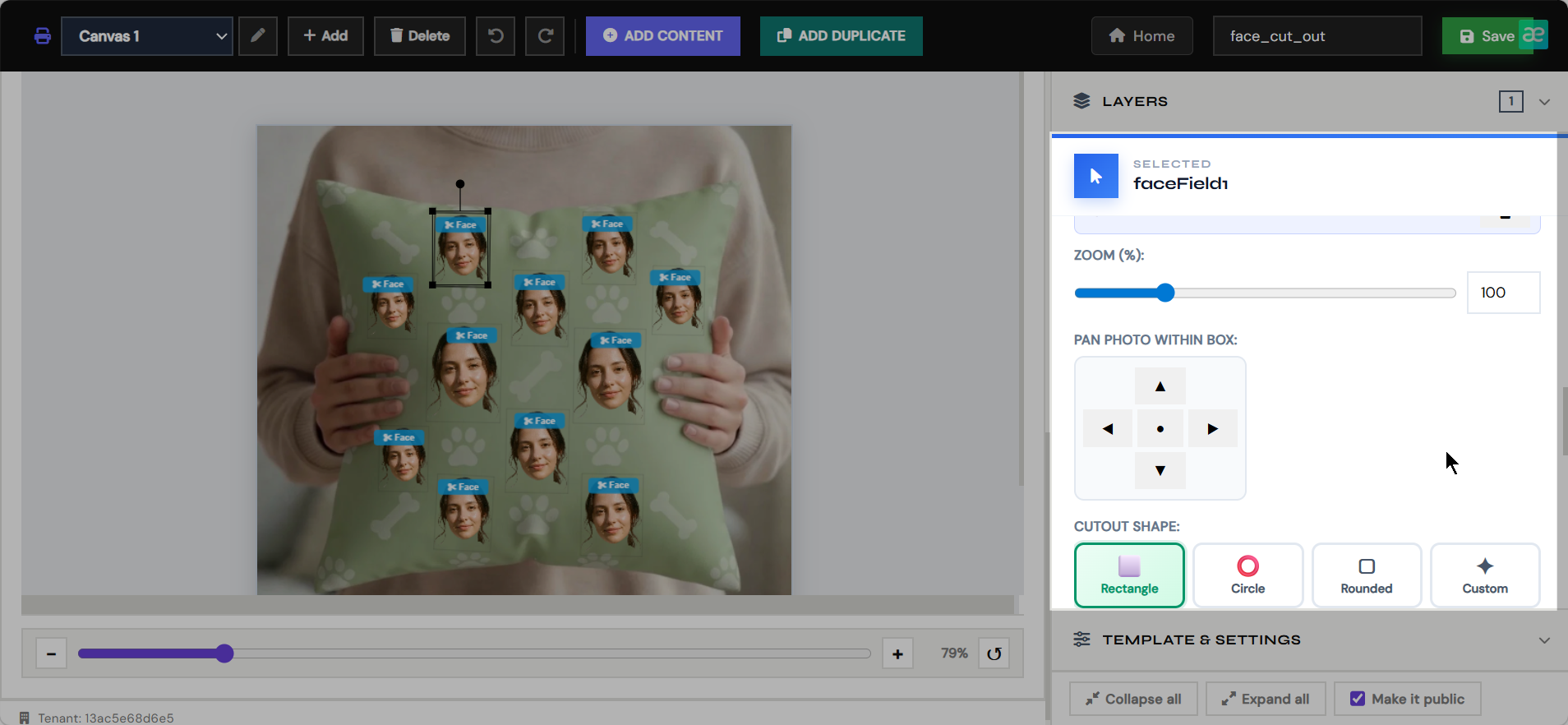
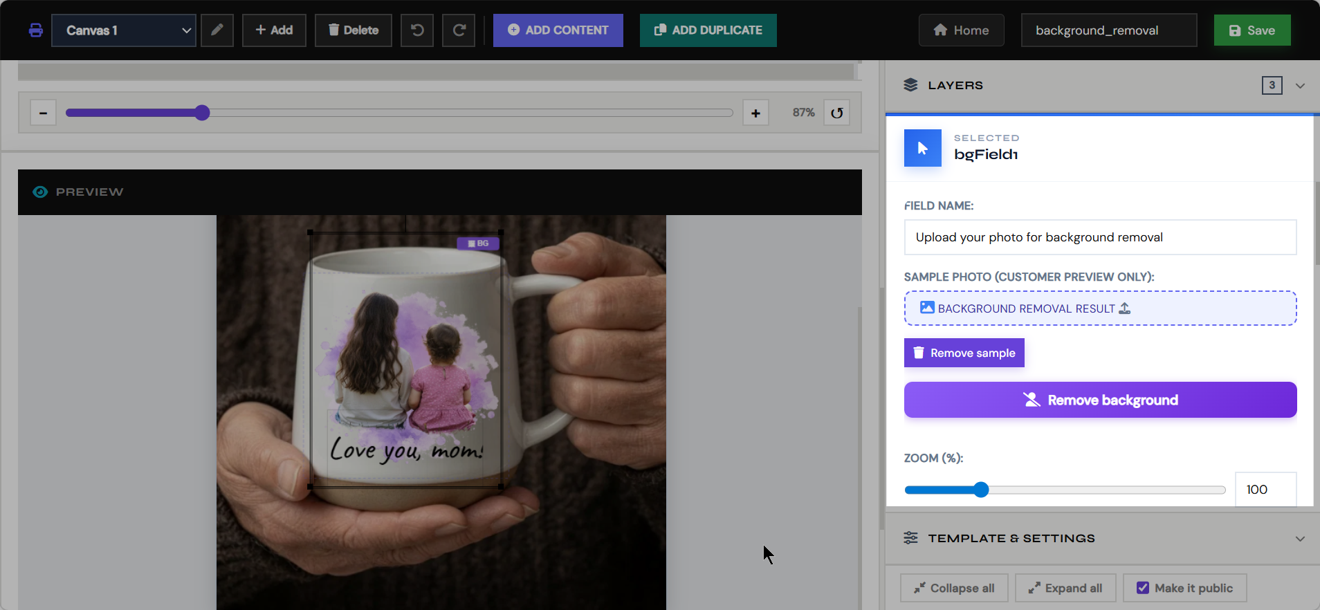
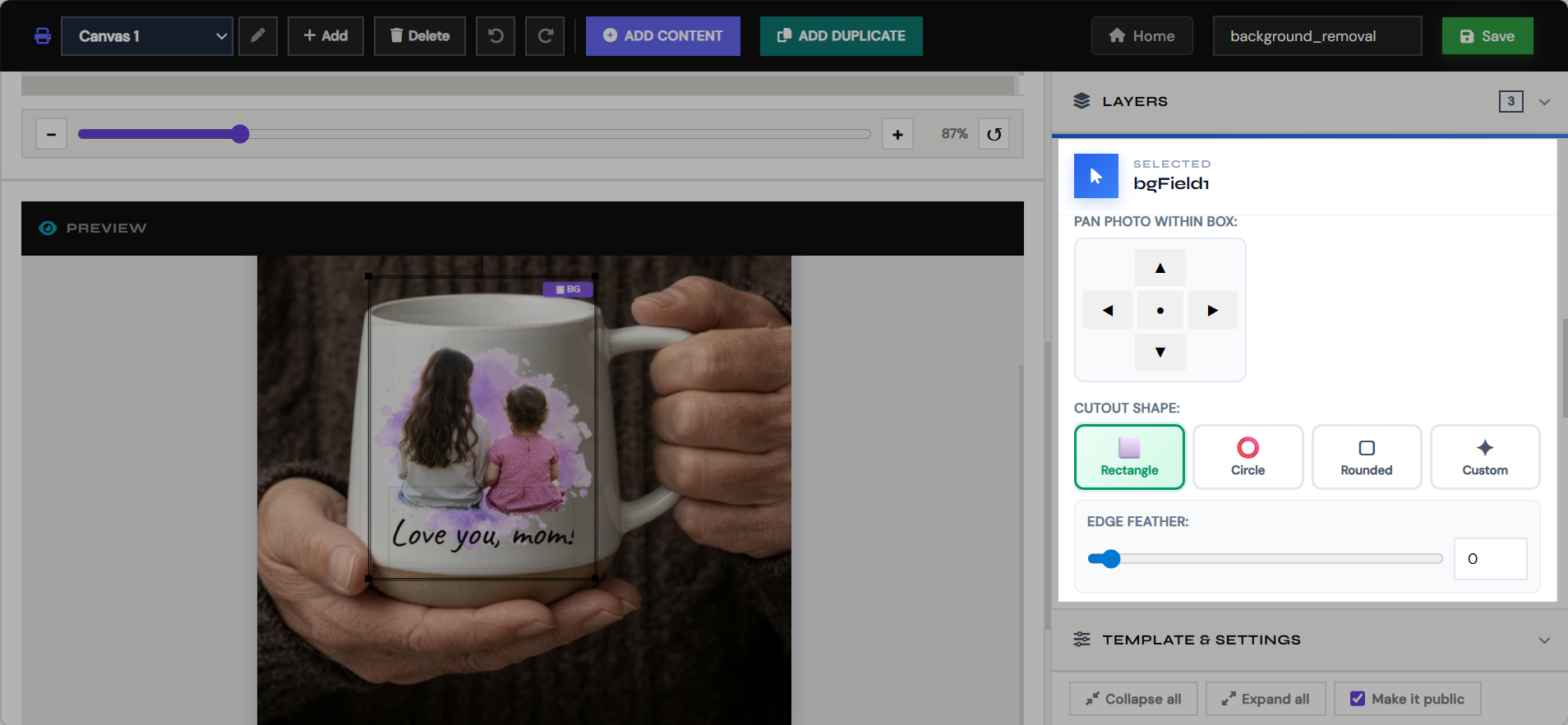
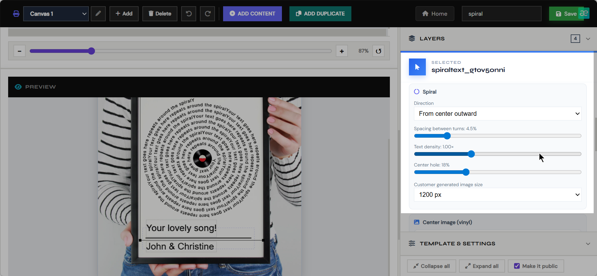
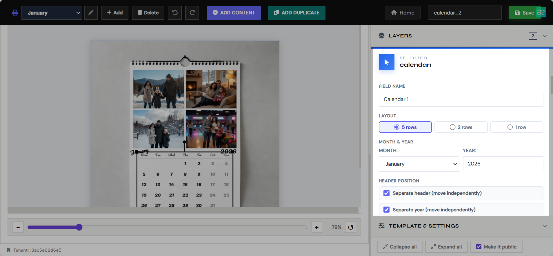
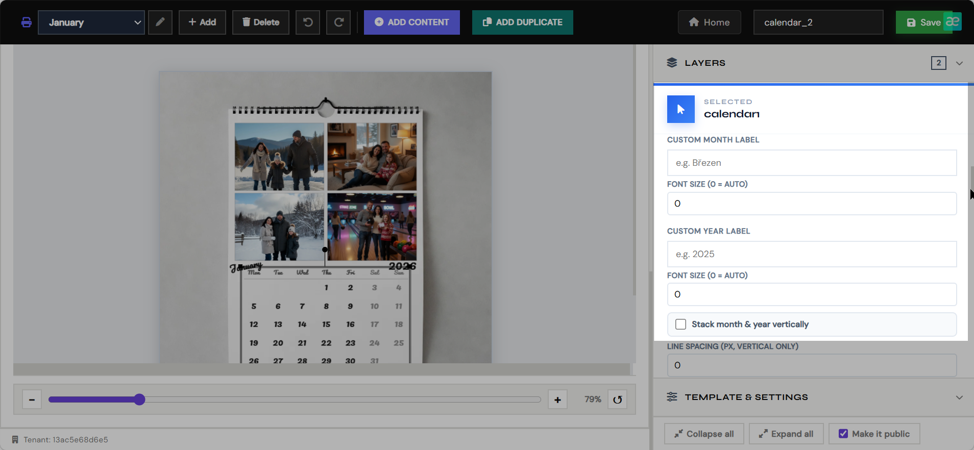
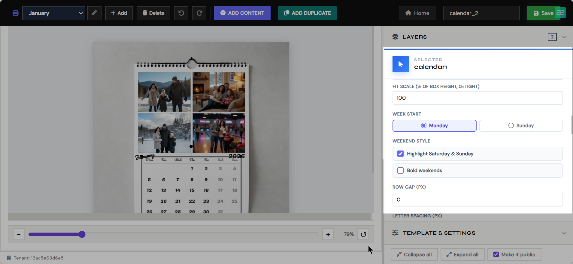
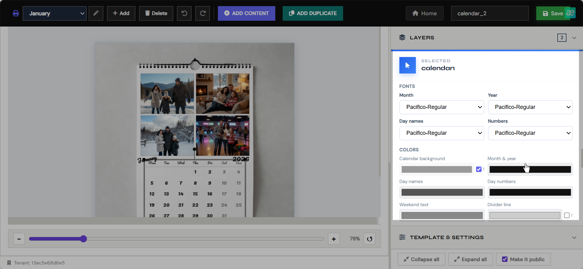
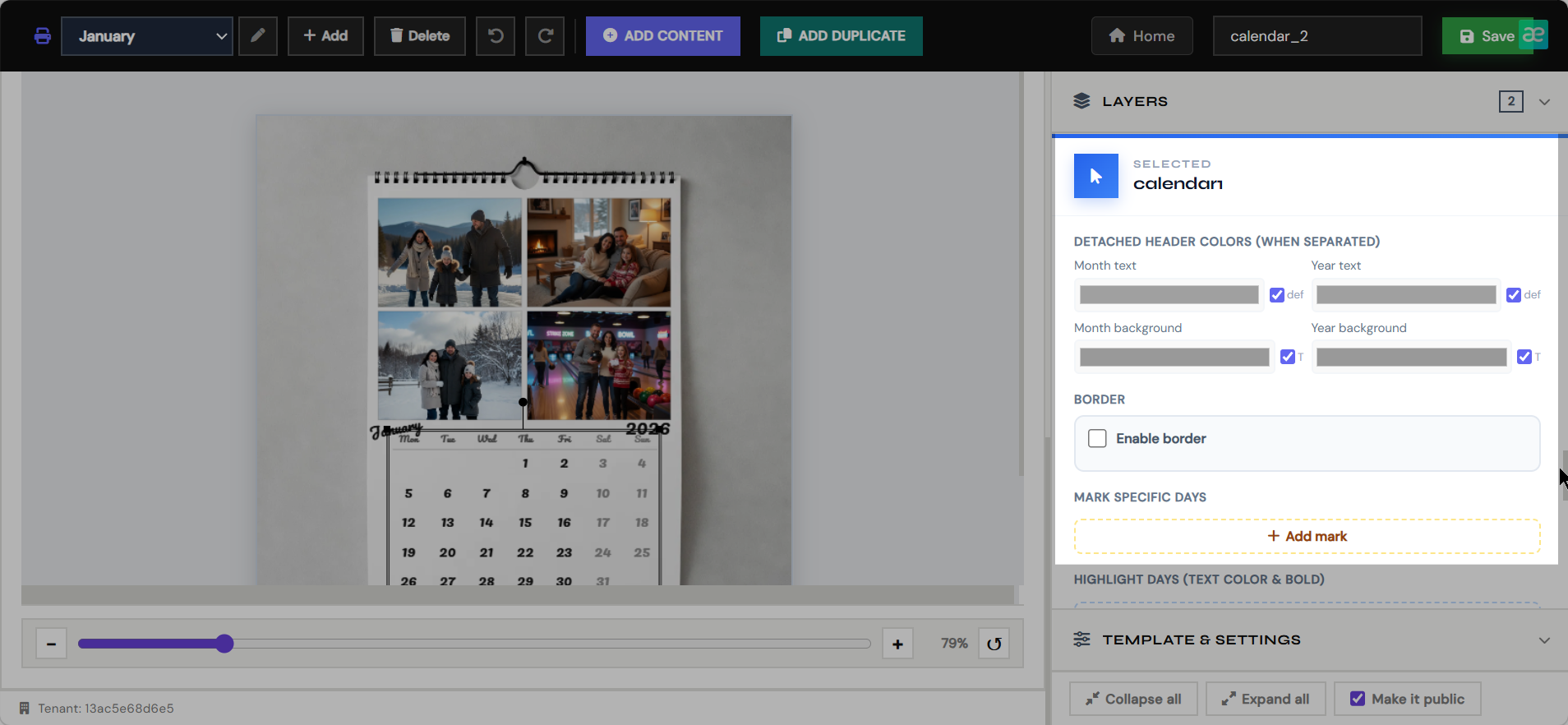
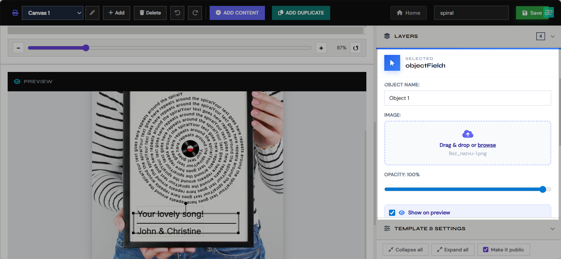
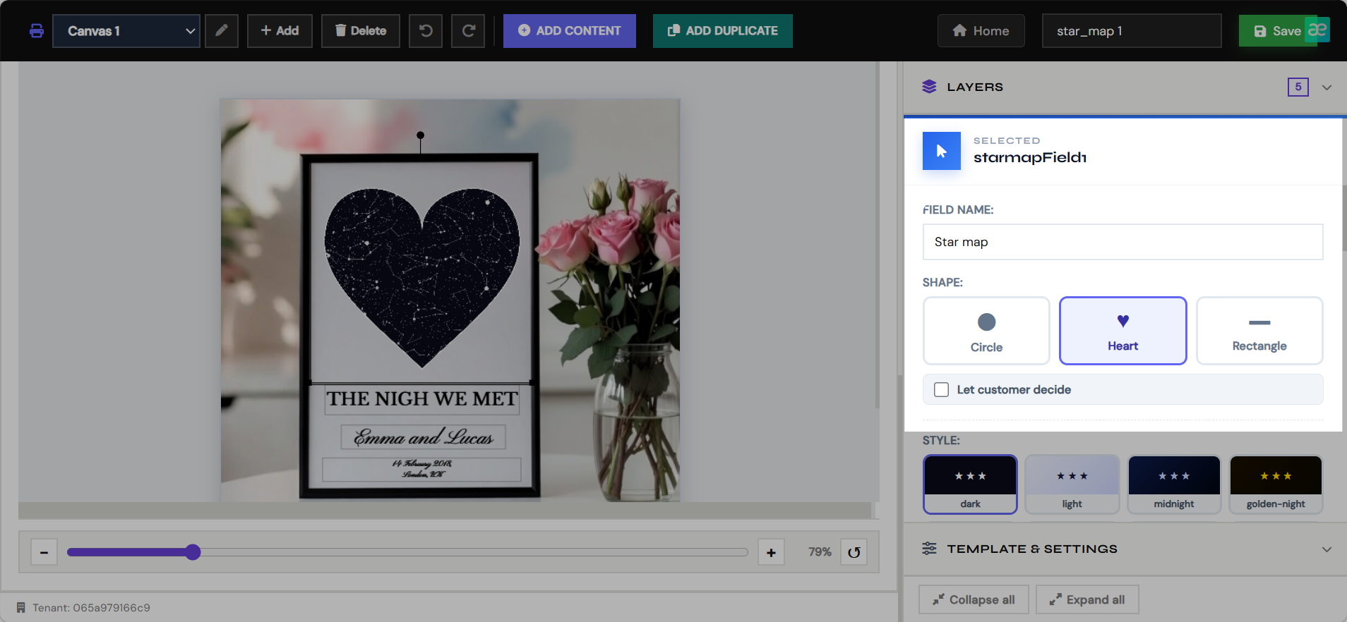
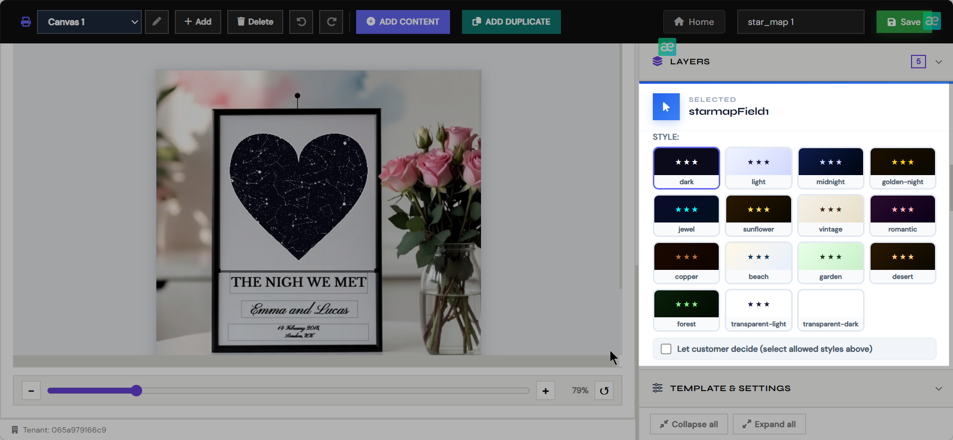
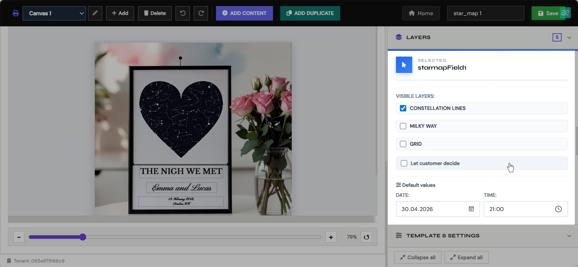
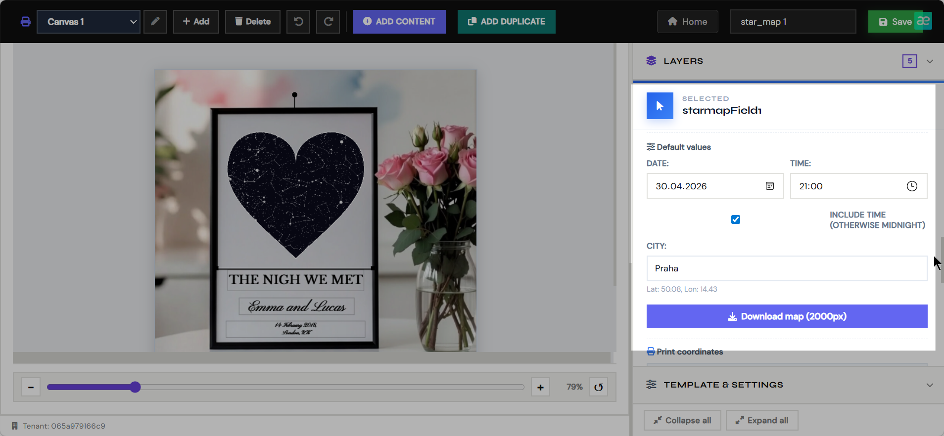
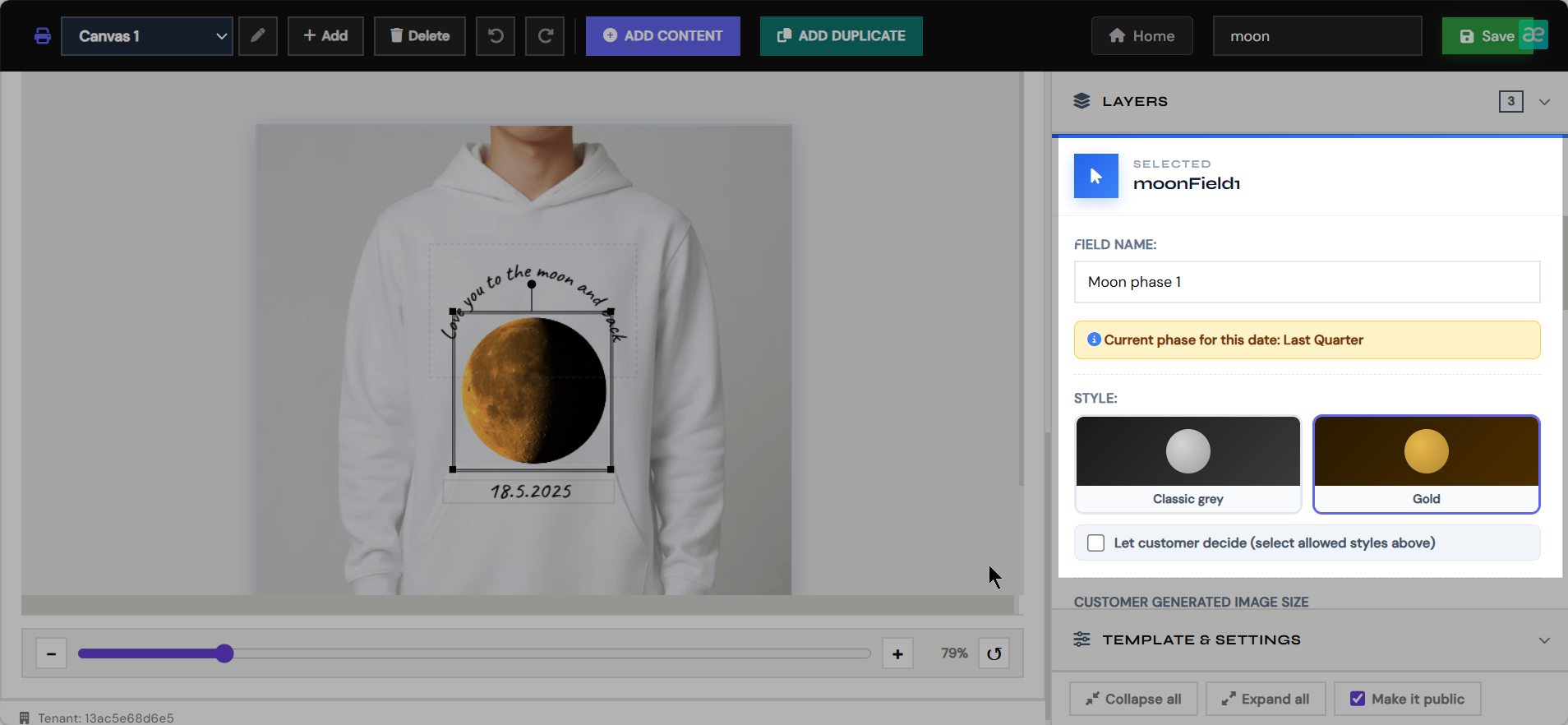
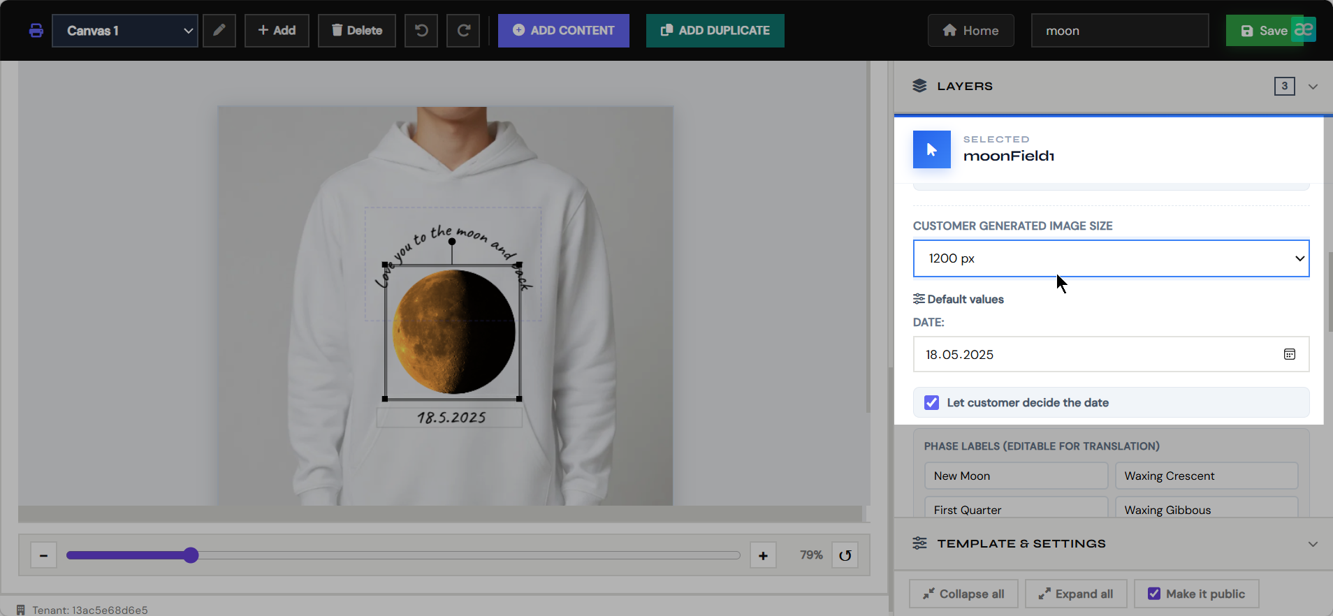
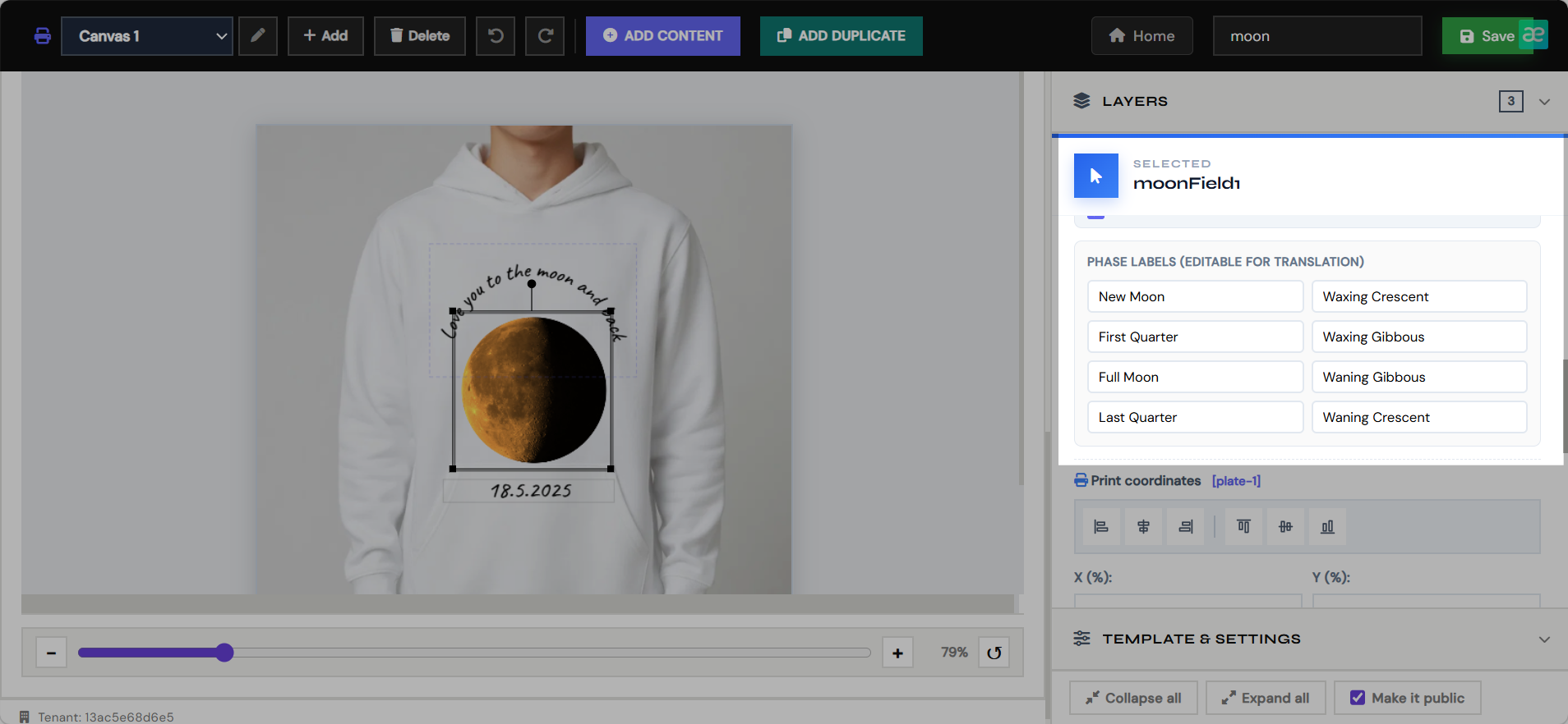
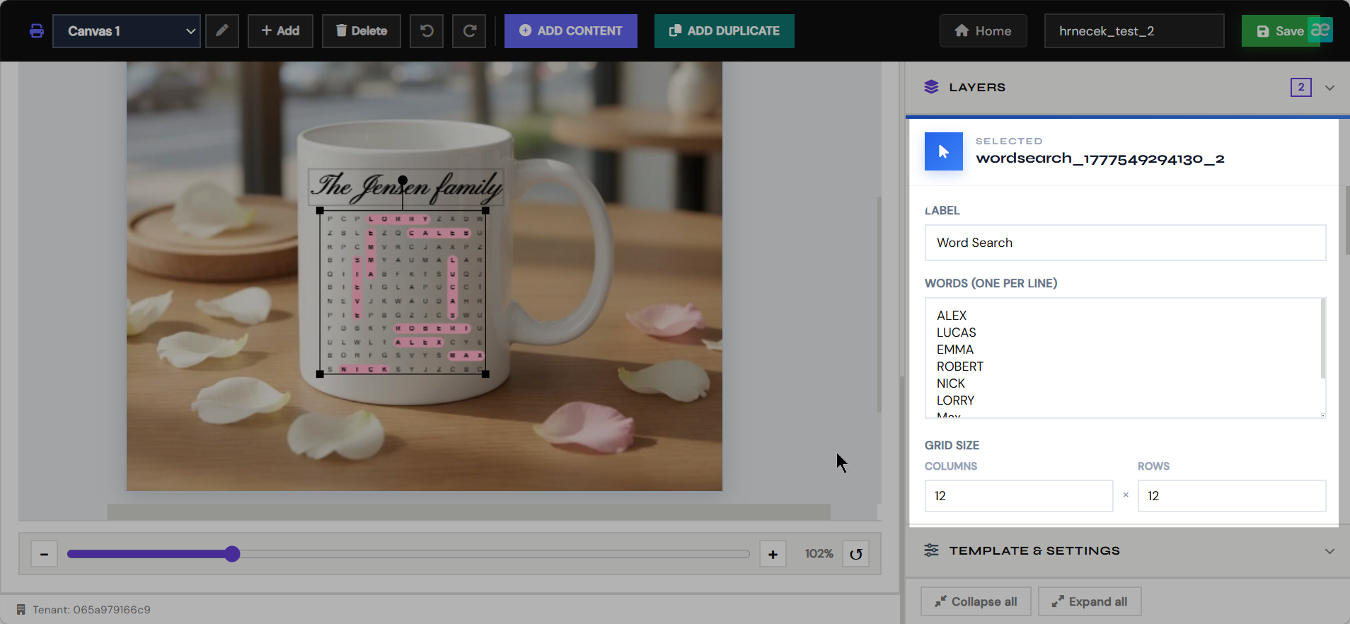
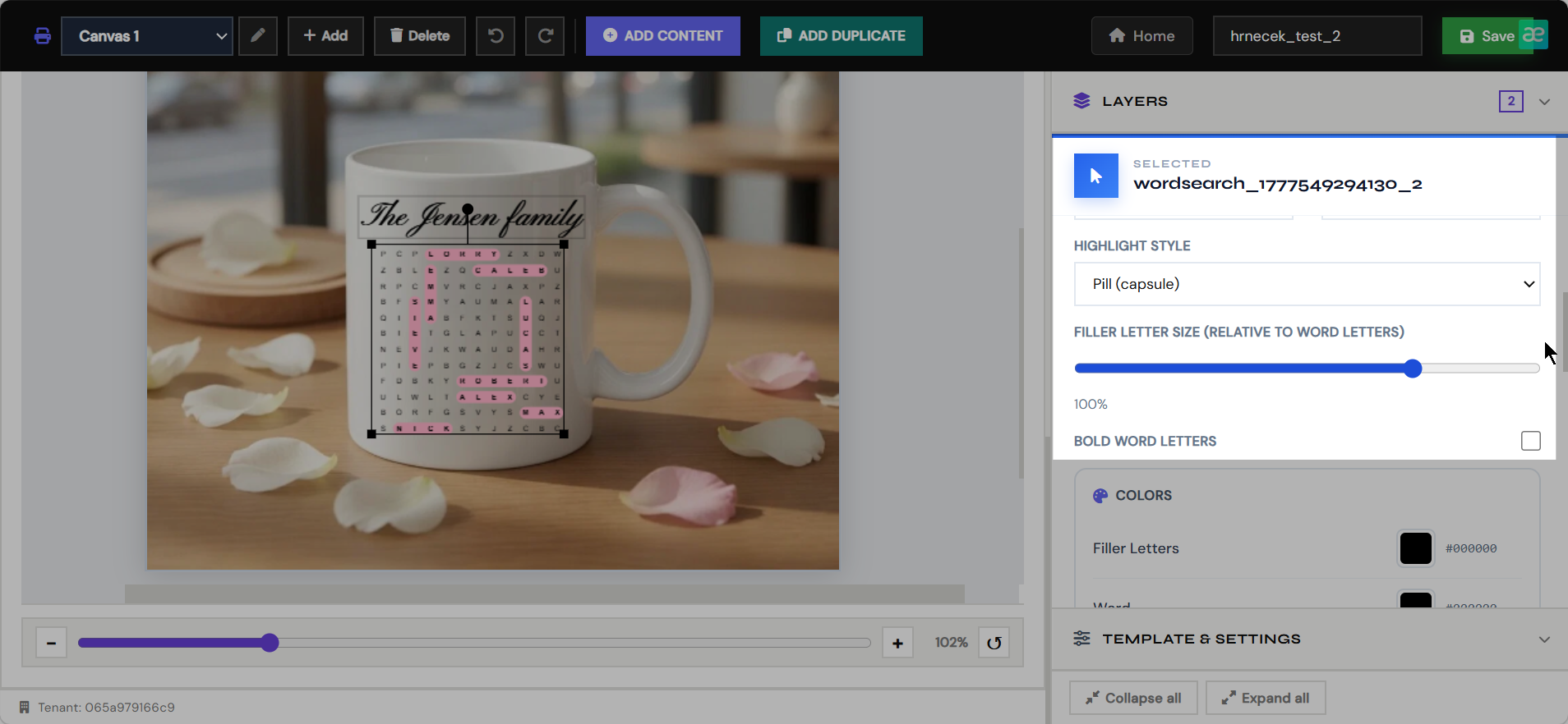
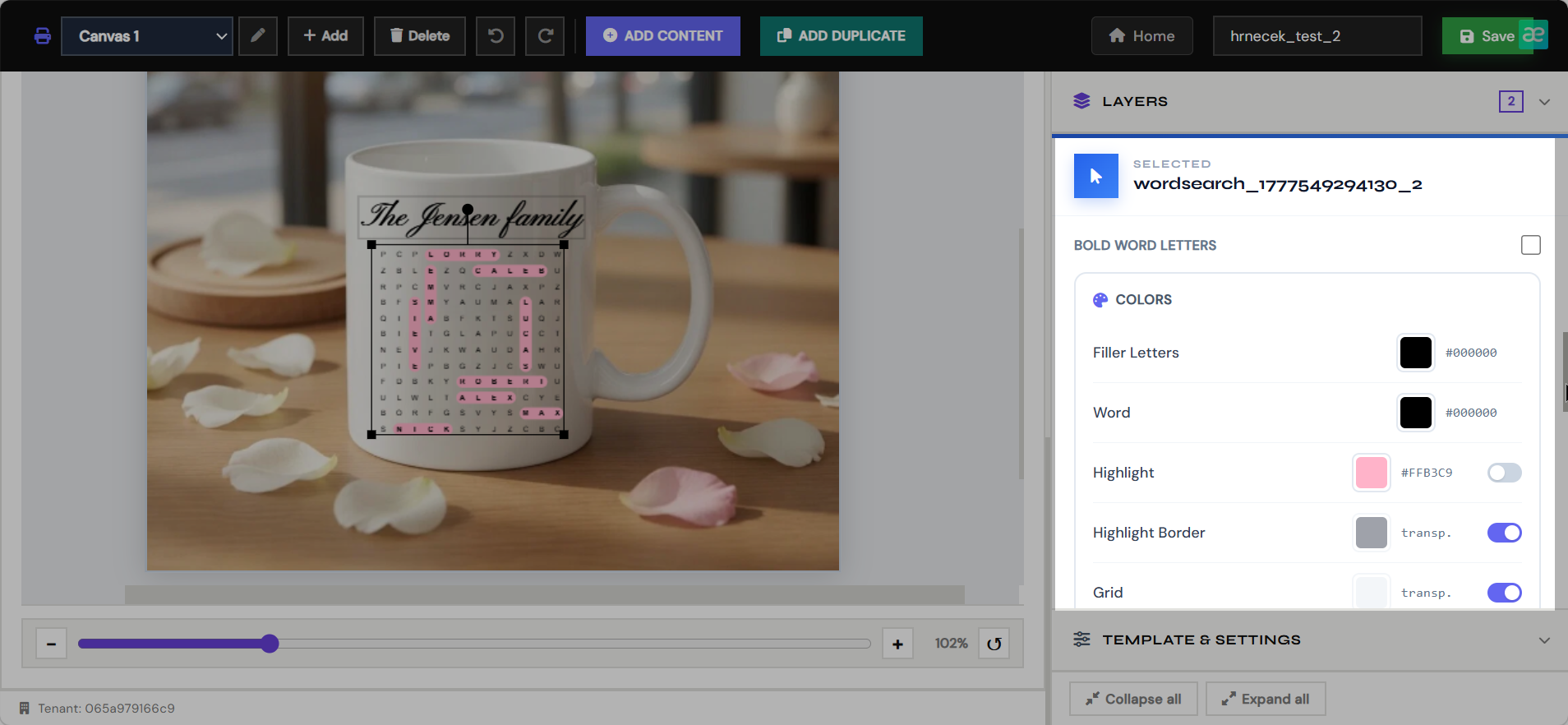
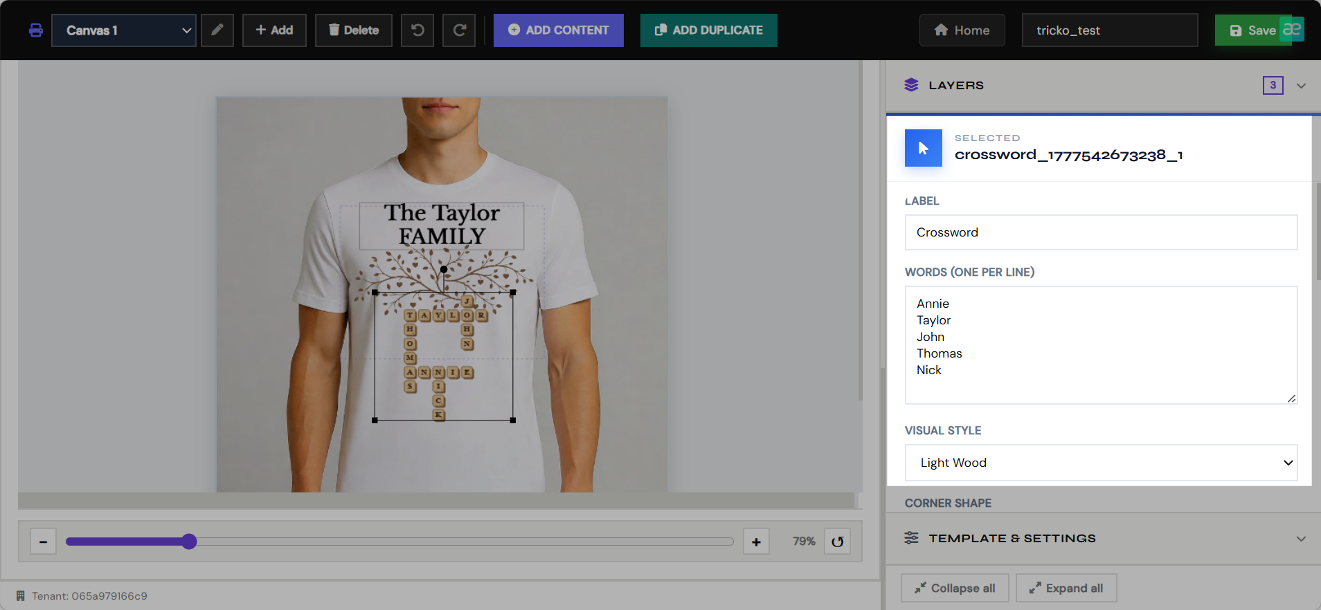
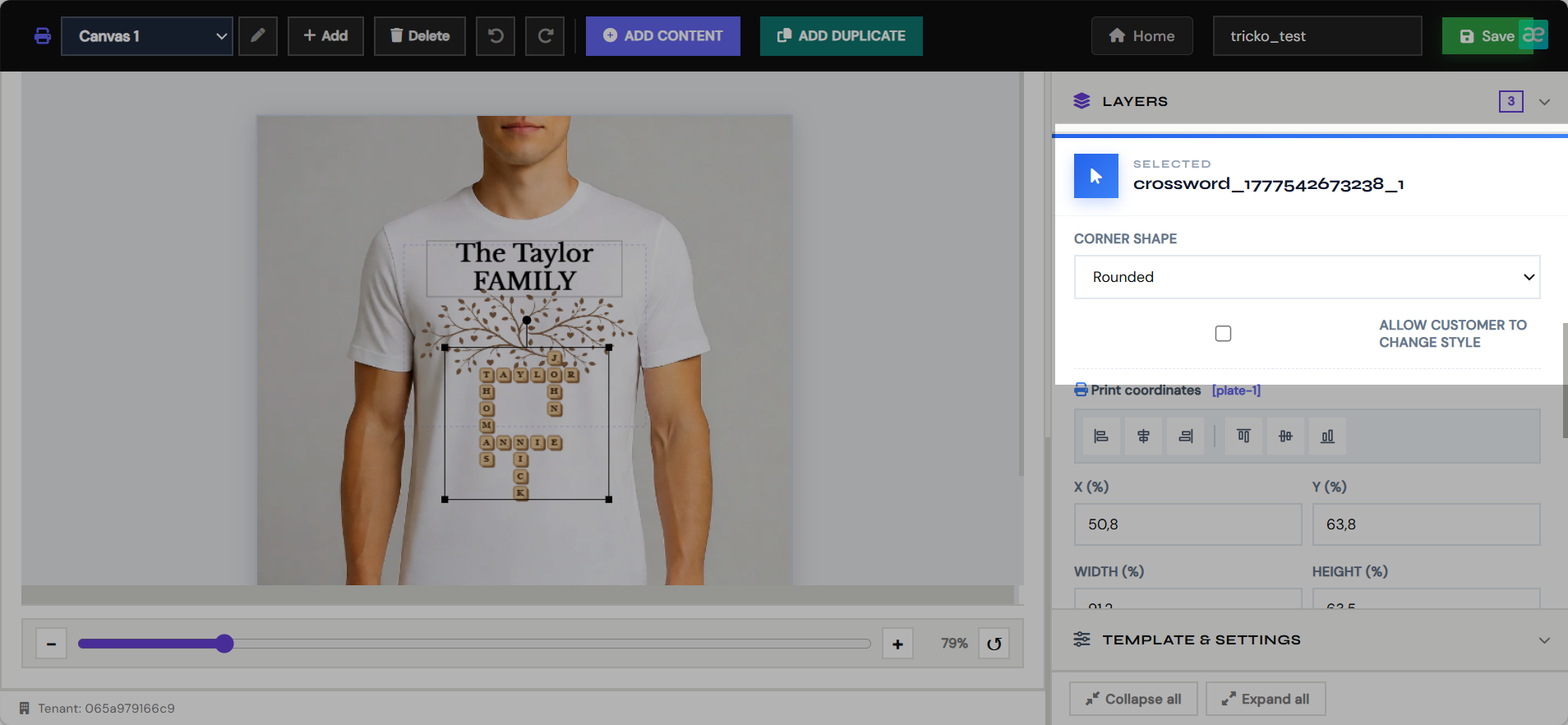
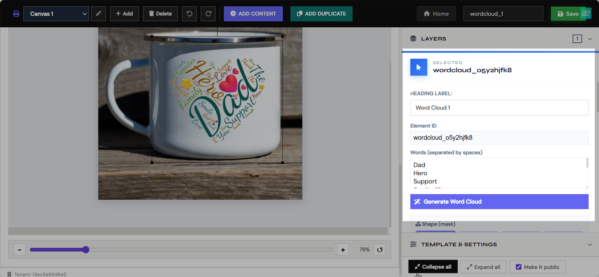
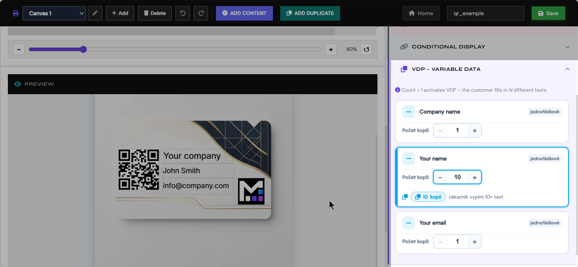
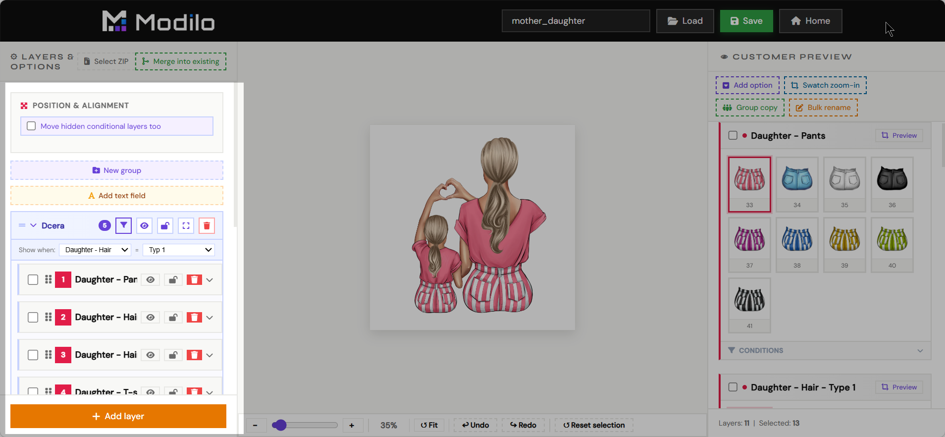
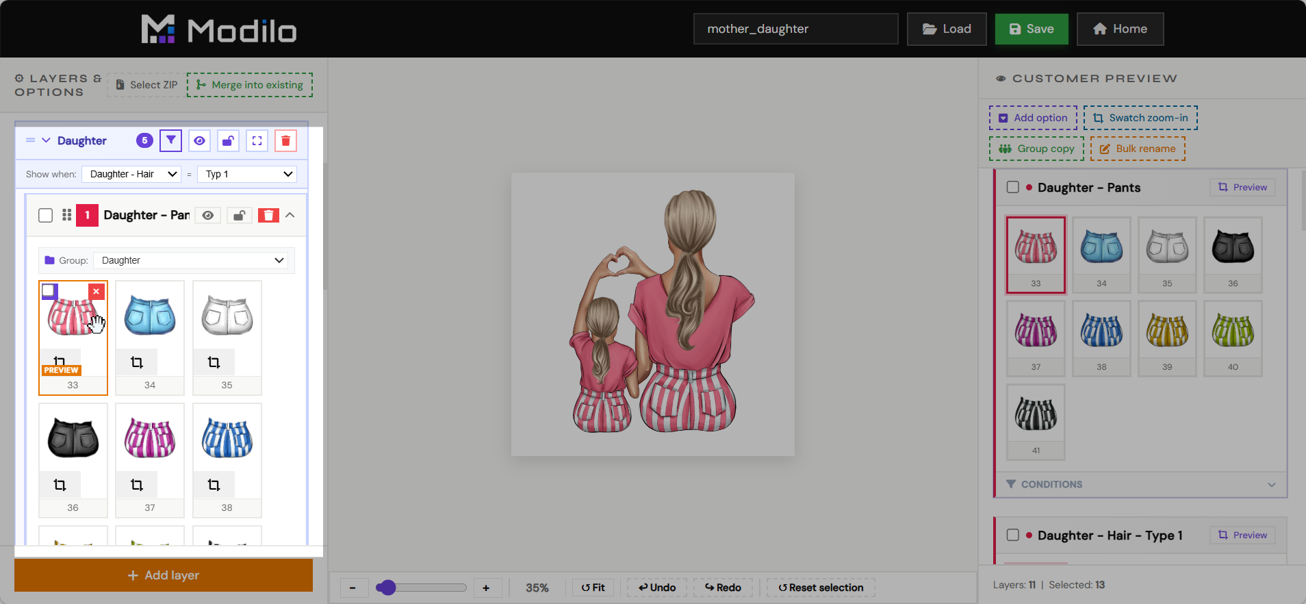
The main editor is where merchants build customer-personalizable product templates. It defines both the production file and the live customer preview.
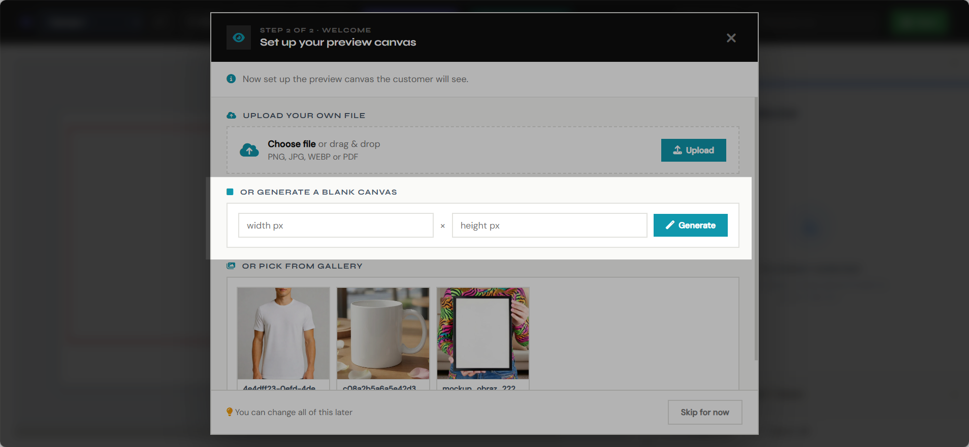
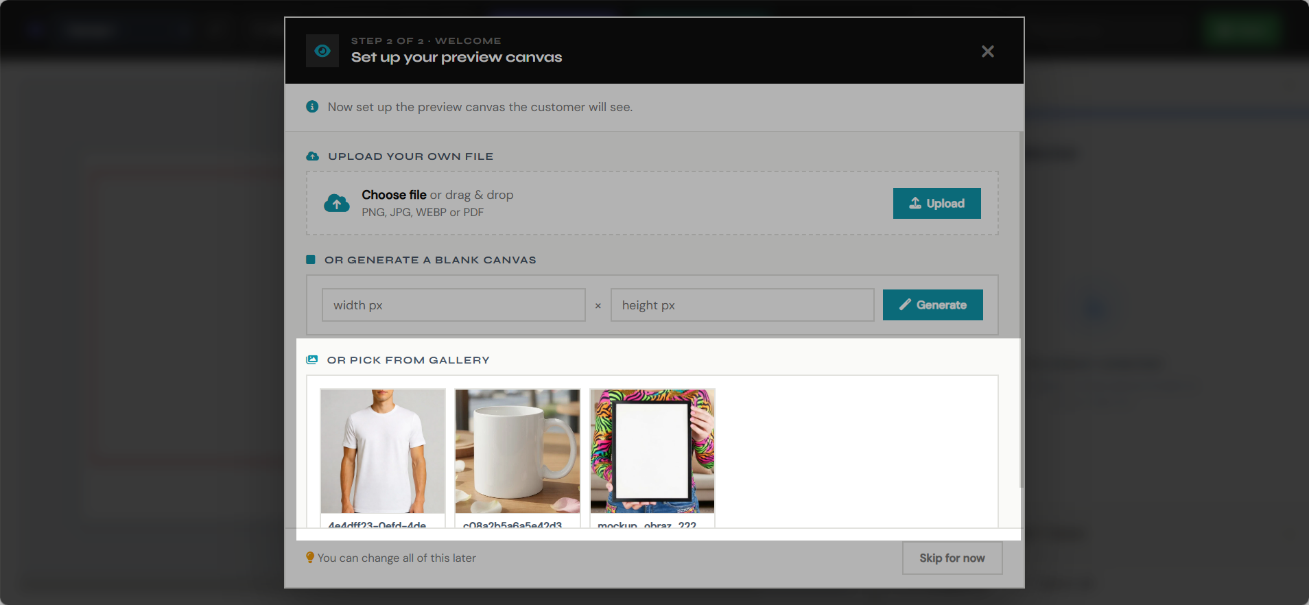
- Create print canvases with real production dimensions.
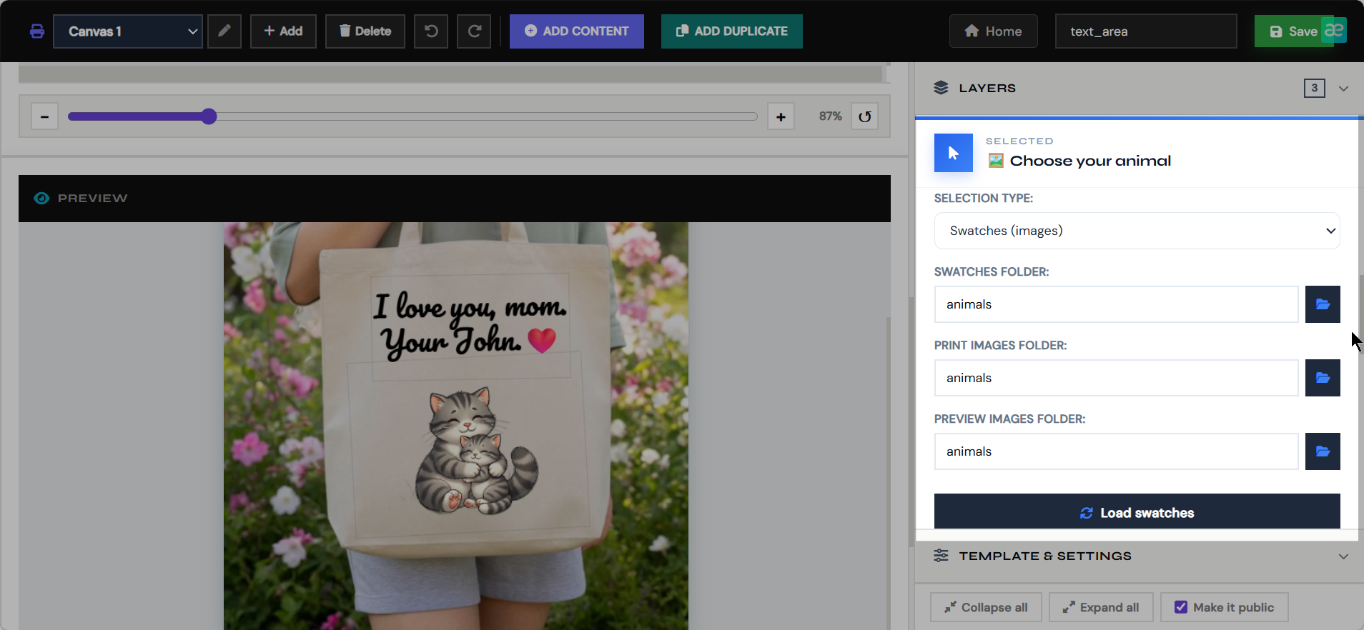
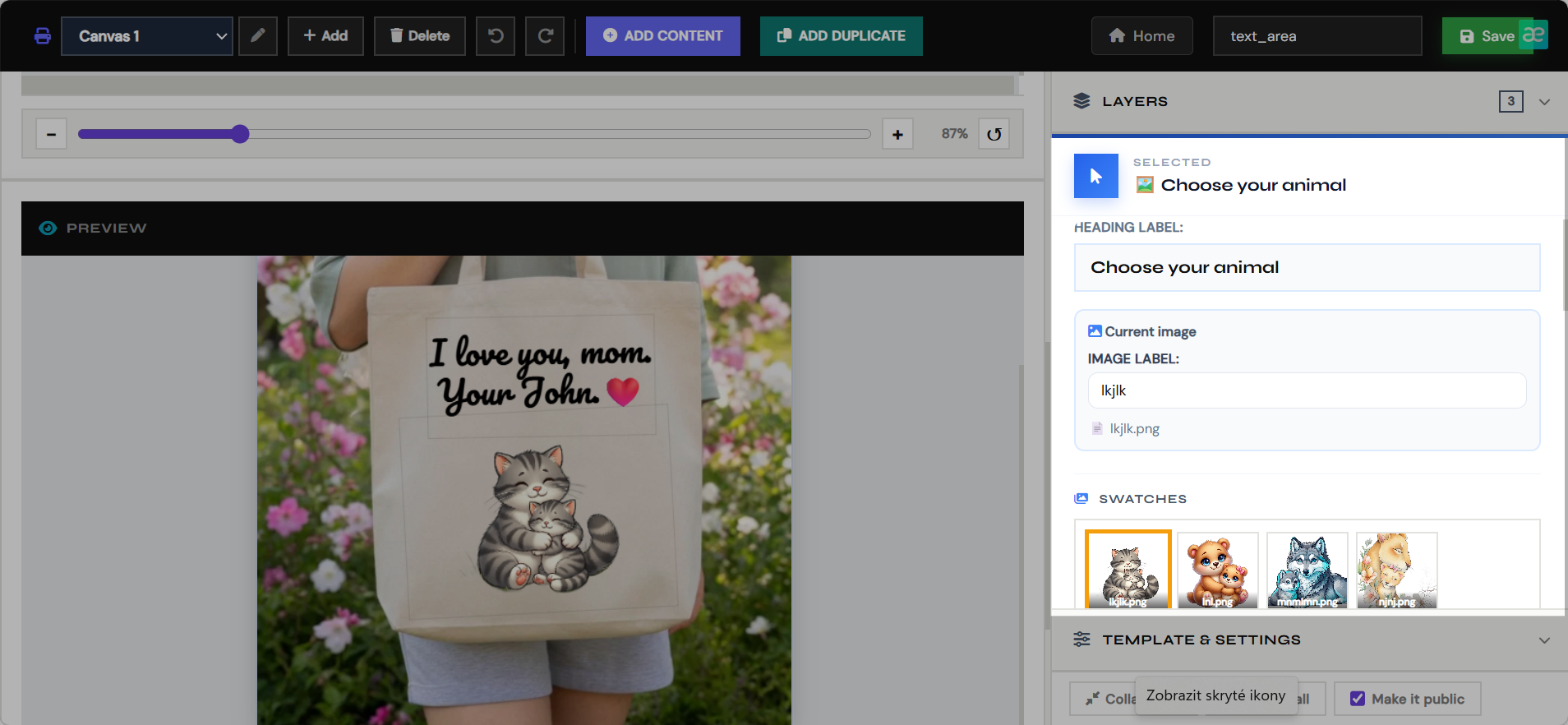
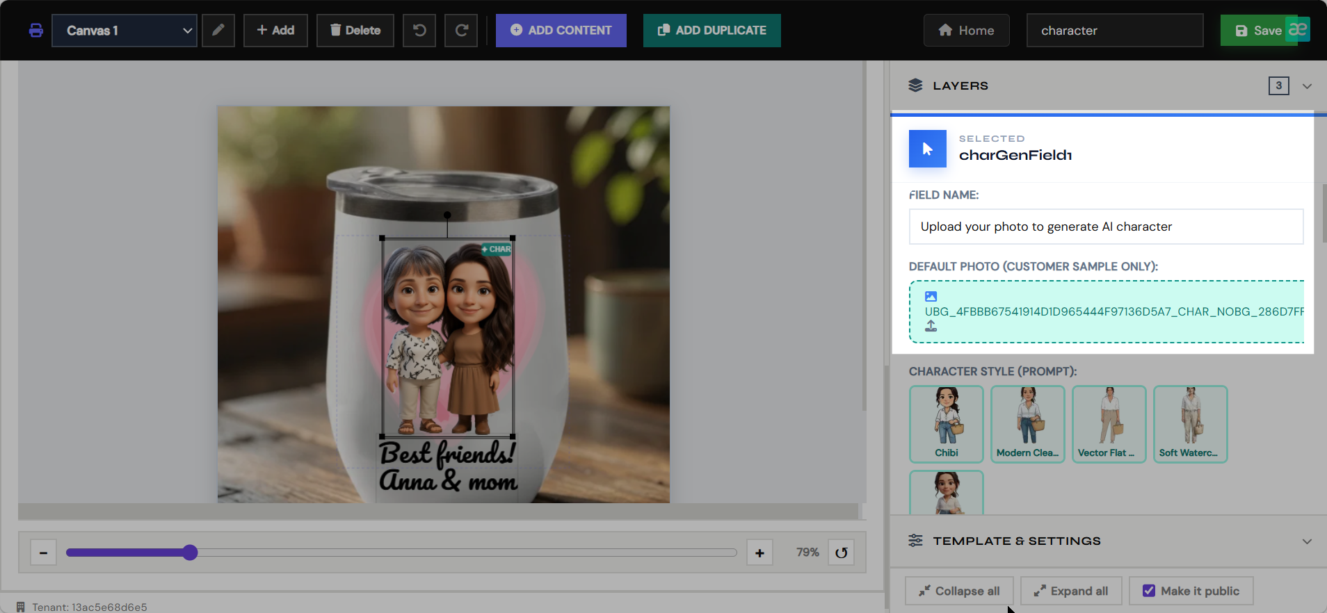
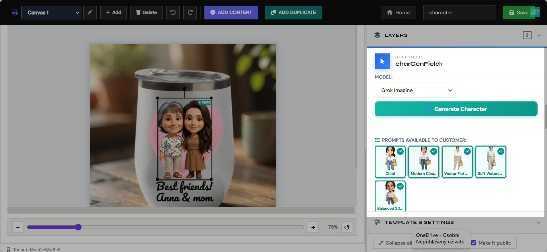
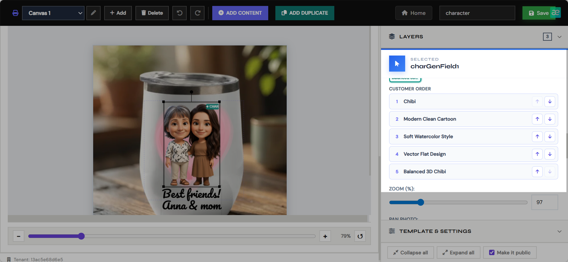
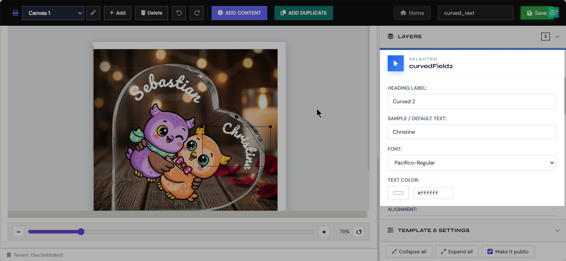
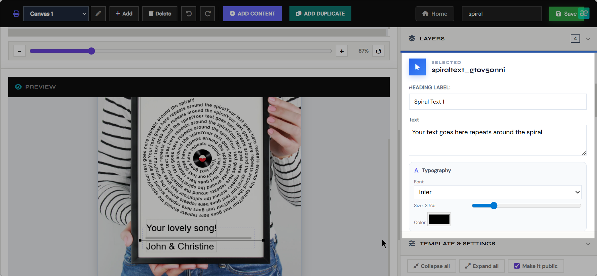
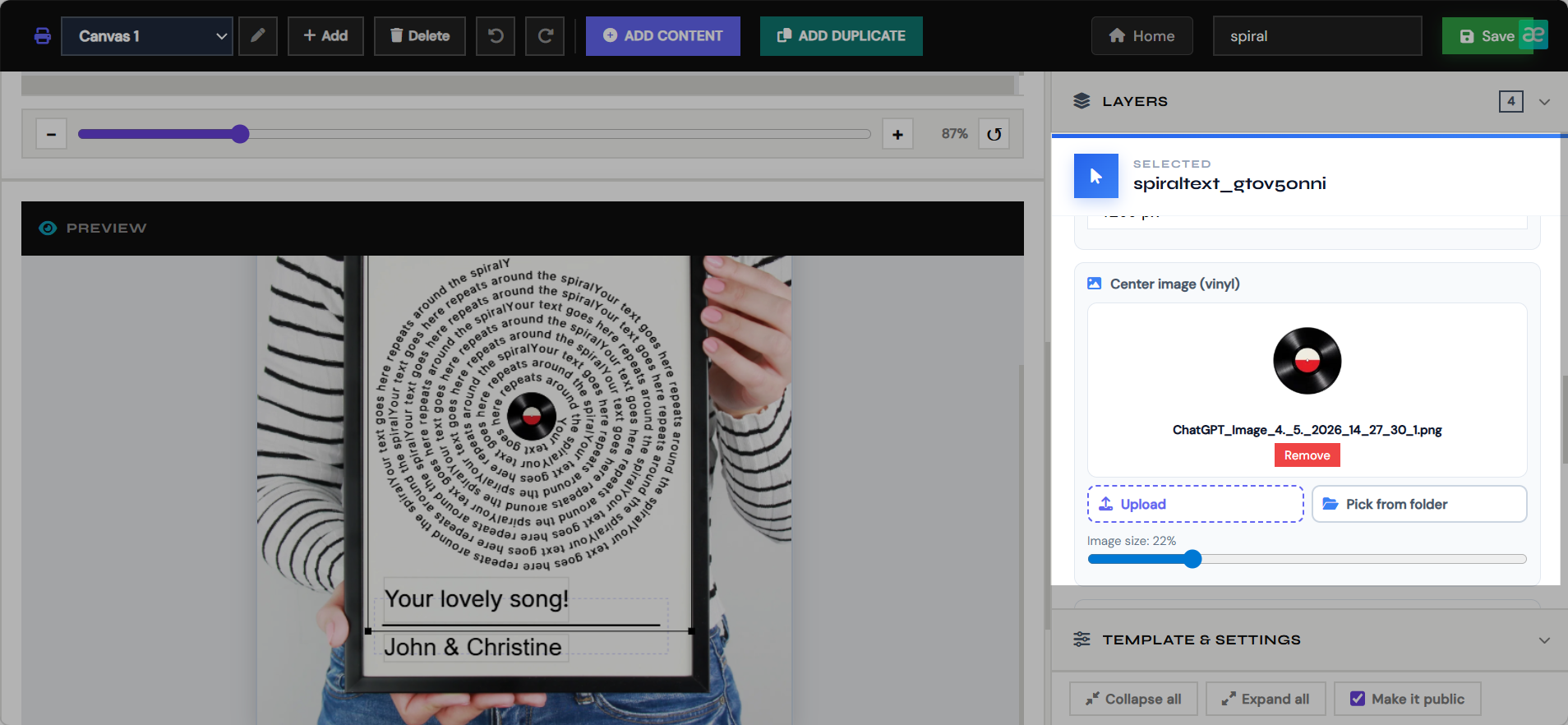
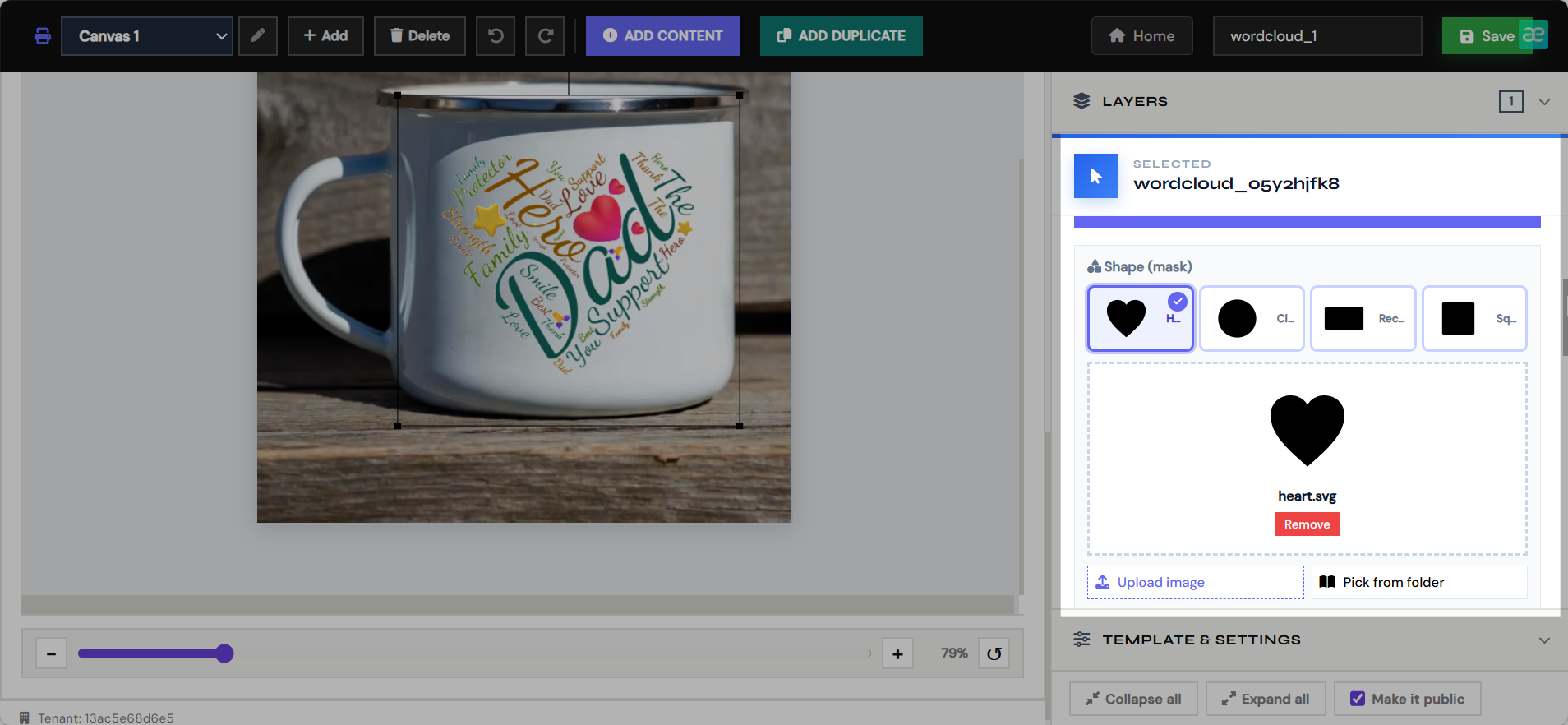
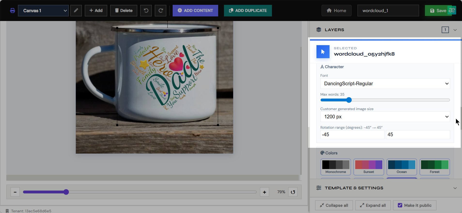
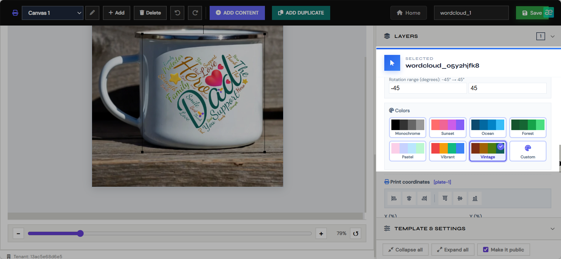
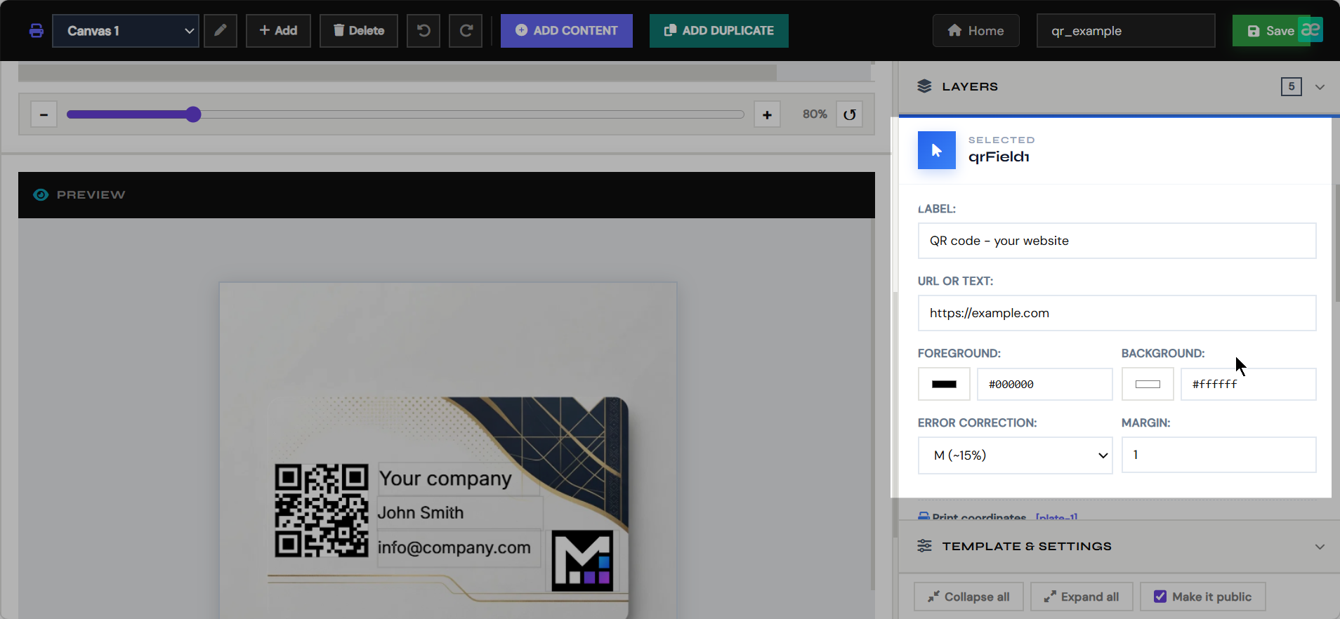
- Add customer fields such as text, photos, AI images, maps, QR codes, calendars, puzzles, and dynamic artwork.
- Position every object separately for print output and storefront preview.
- Save the template so it can be paired with a Shopify product and rendered into final PDFs.
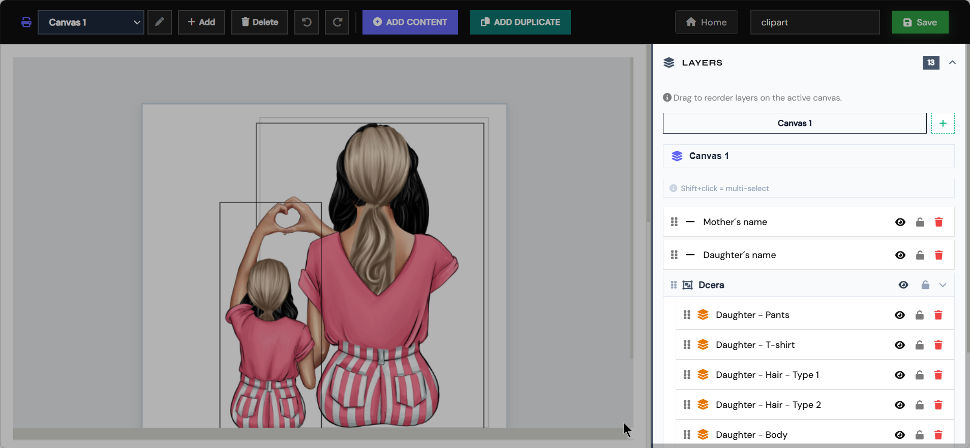
Clipart Editor
Variant artwork
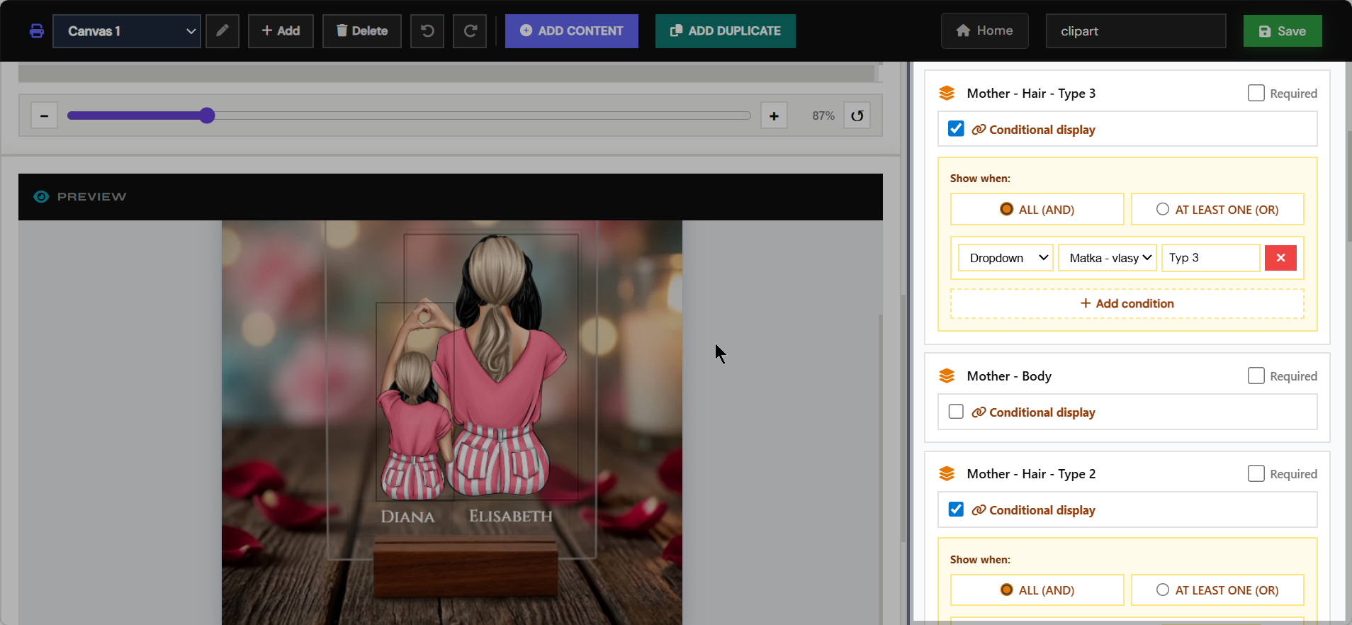
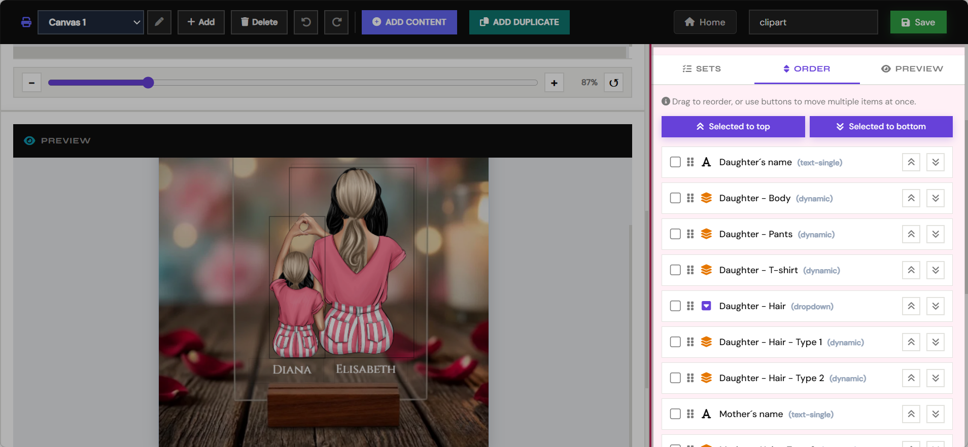
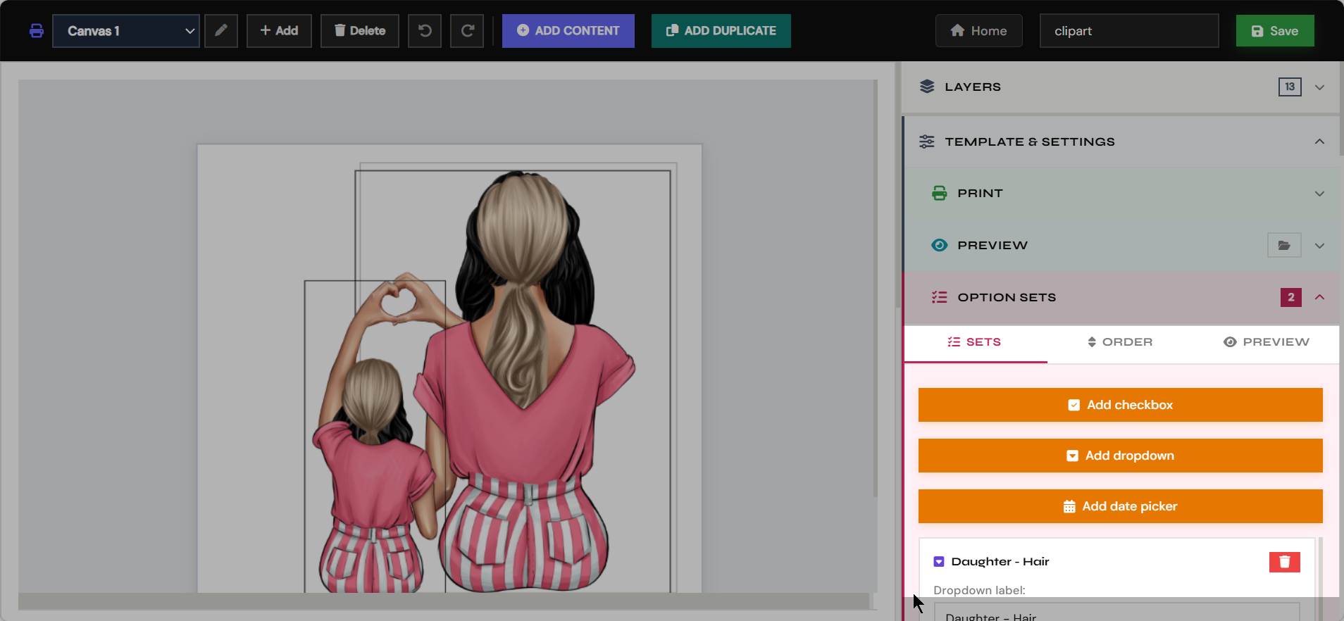
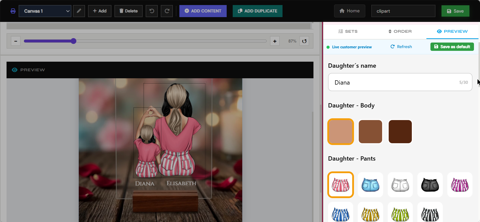
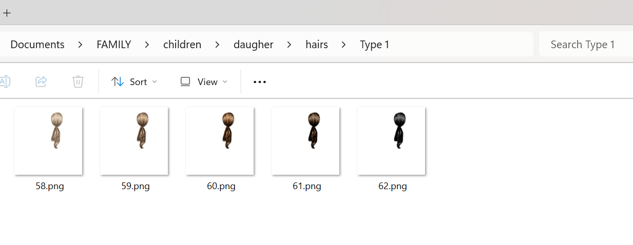
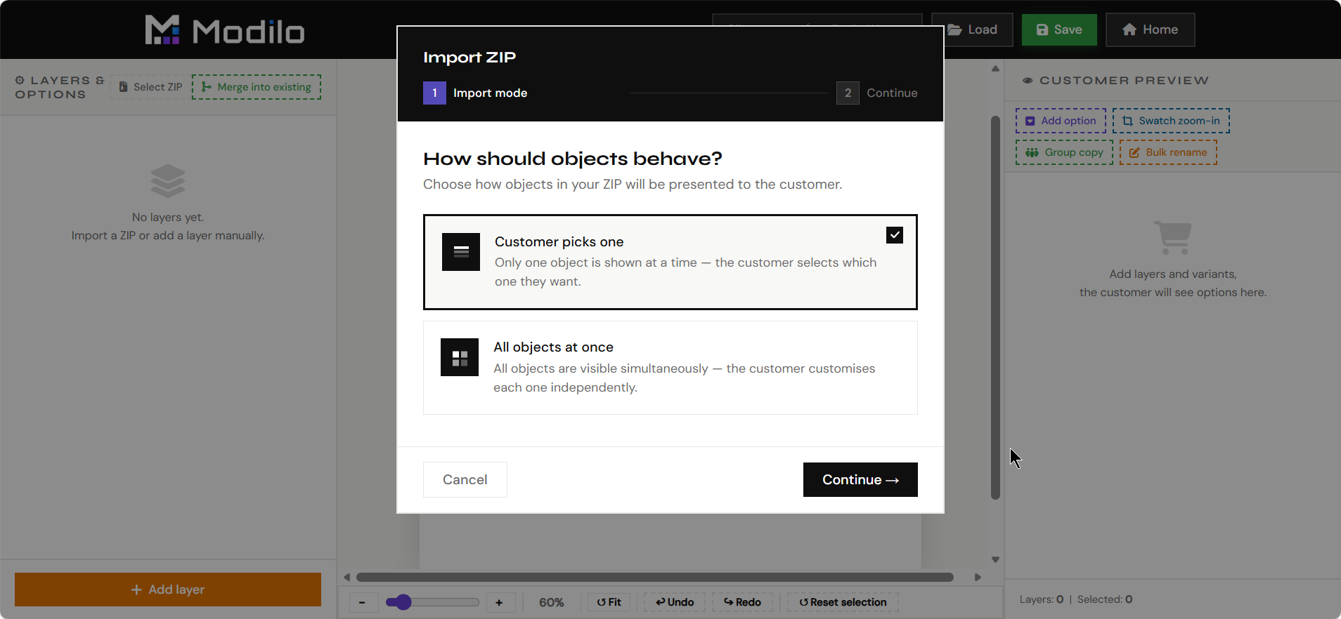
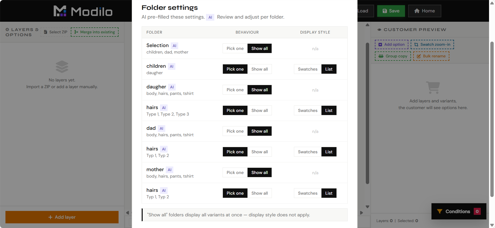
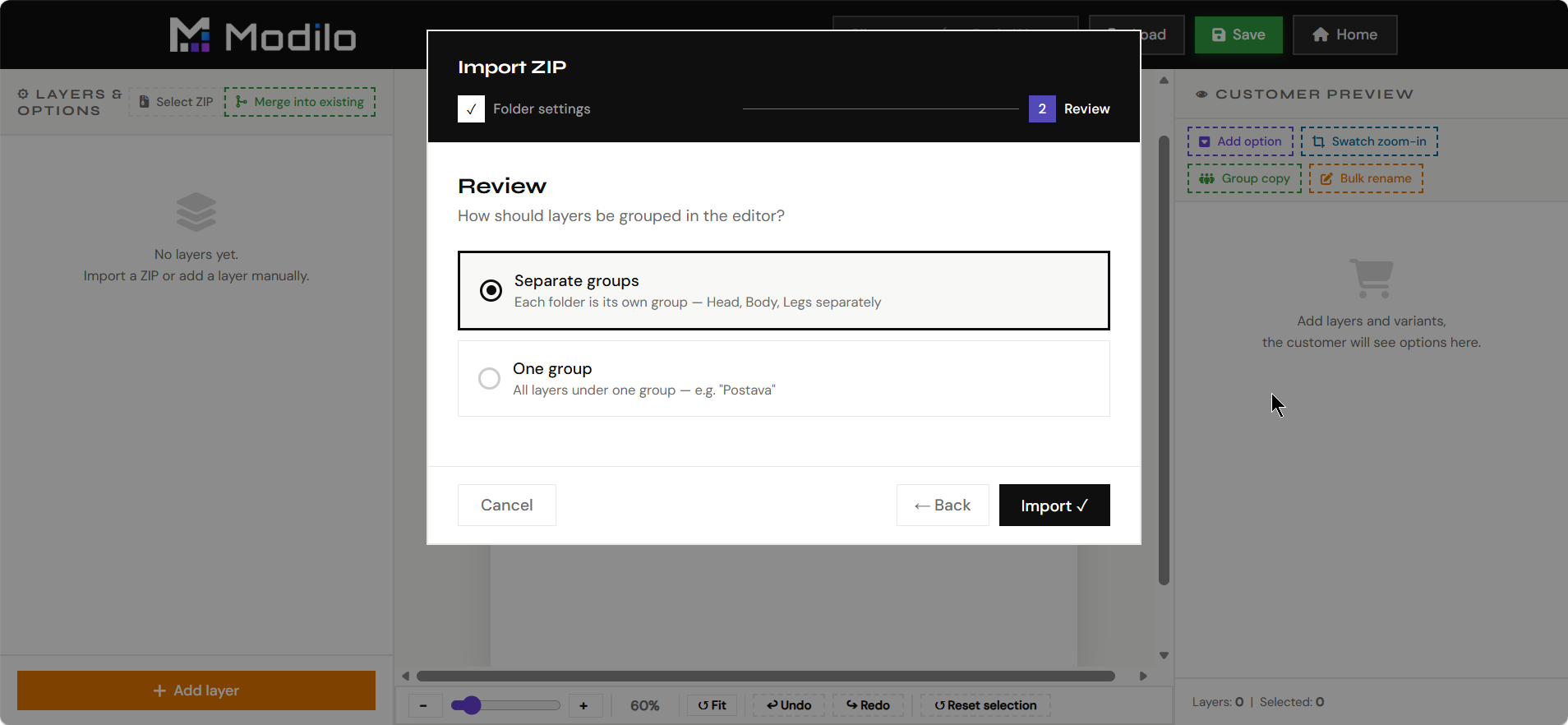
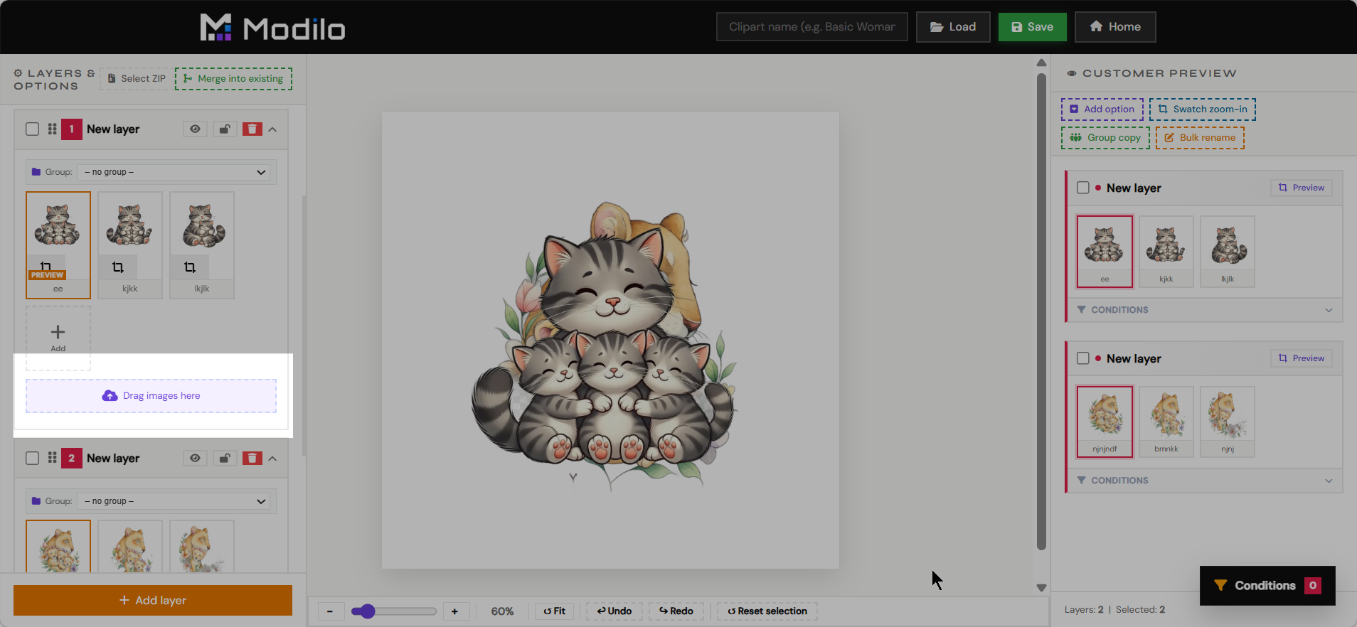
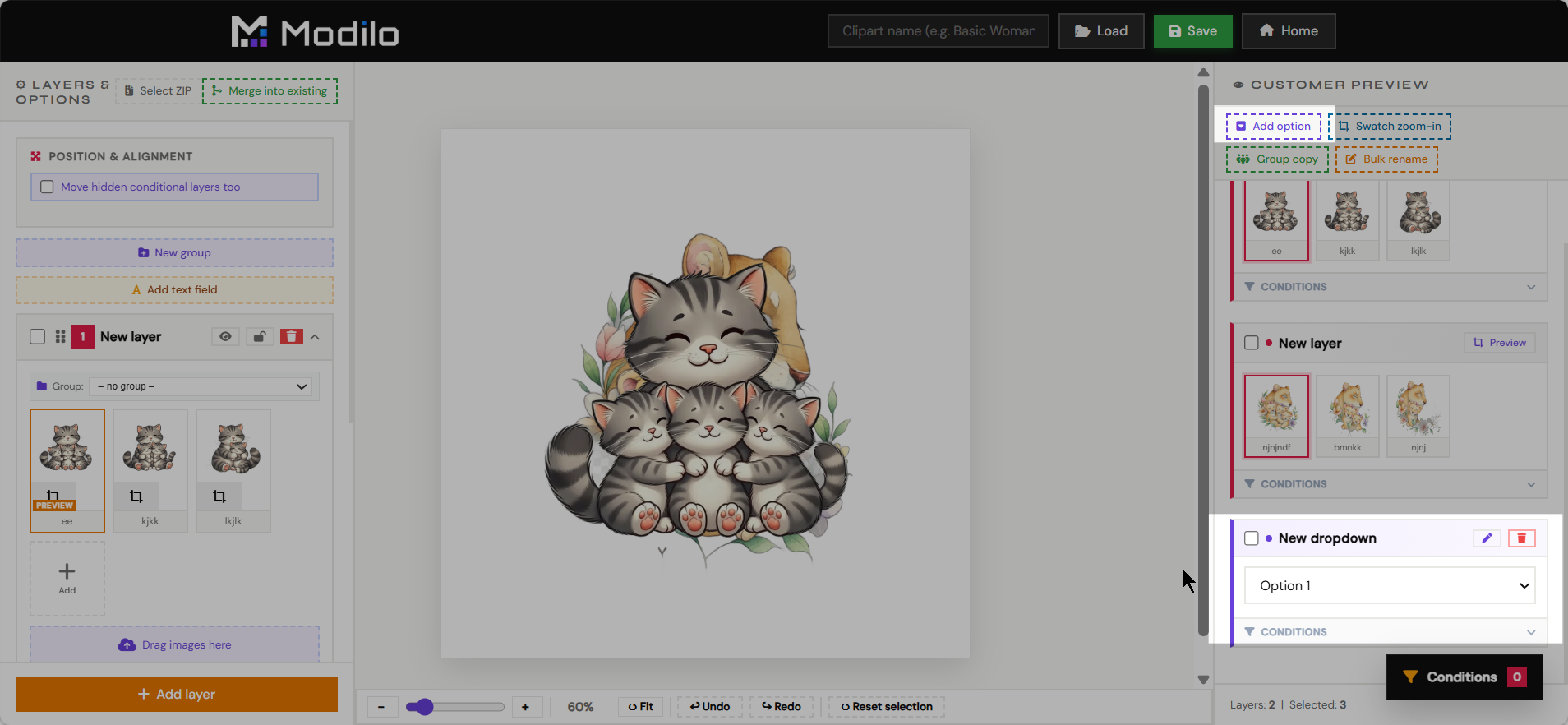
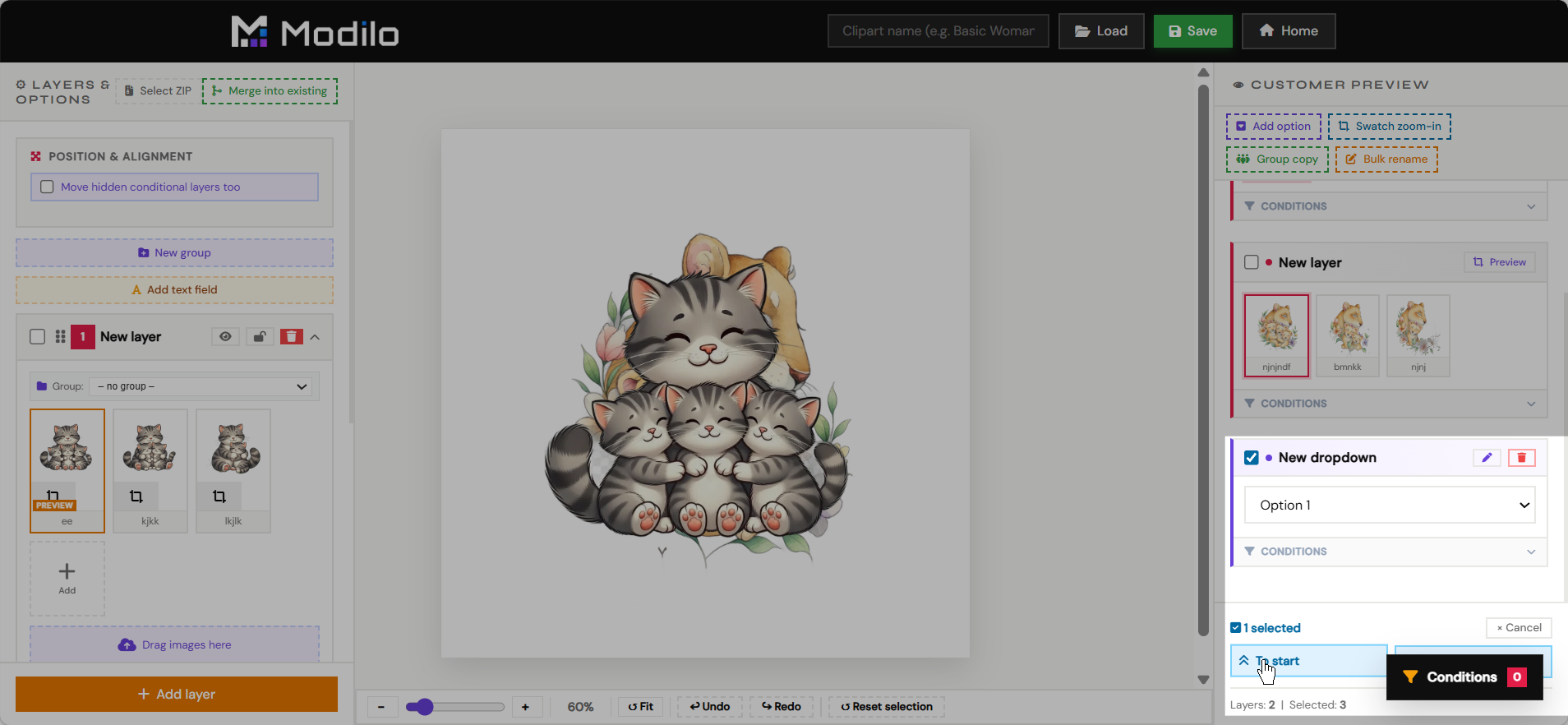
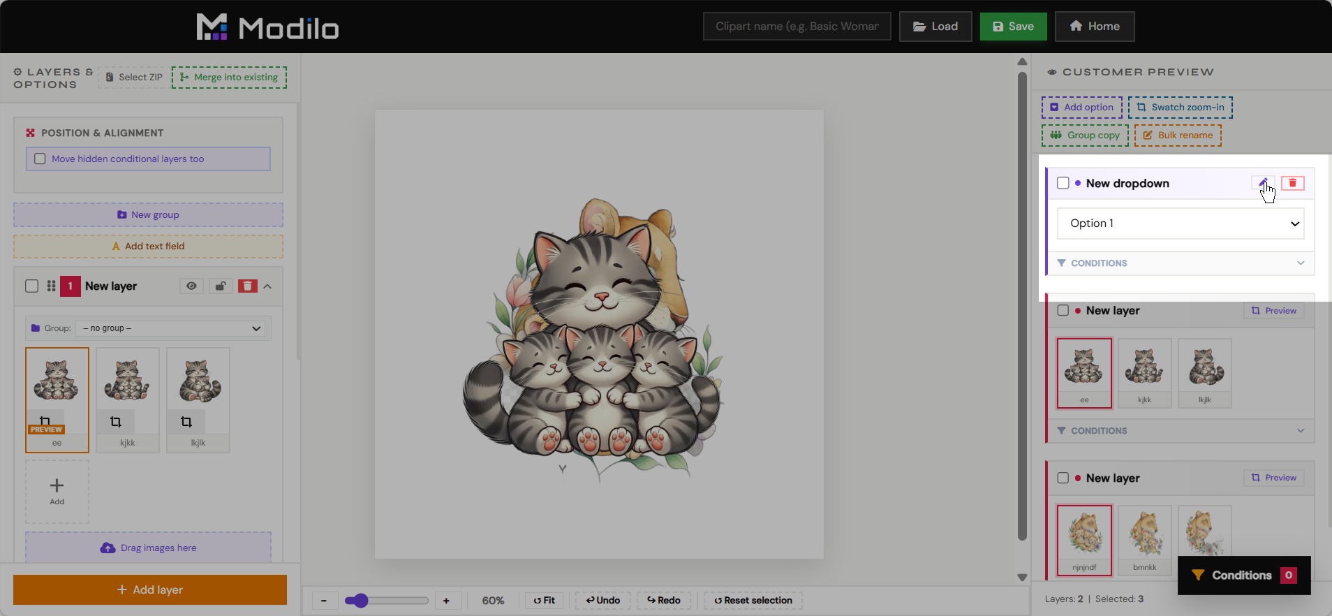
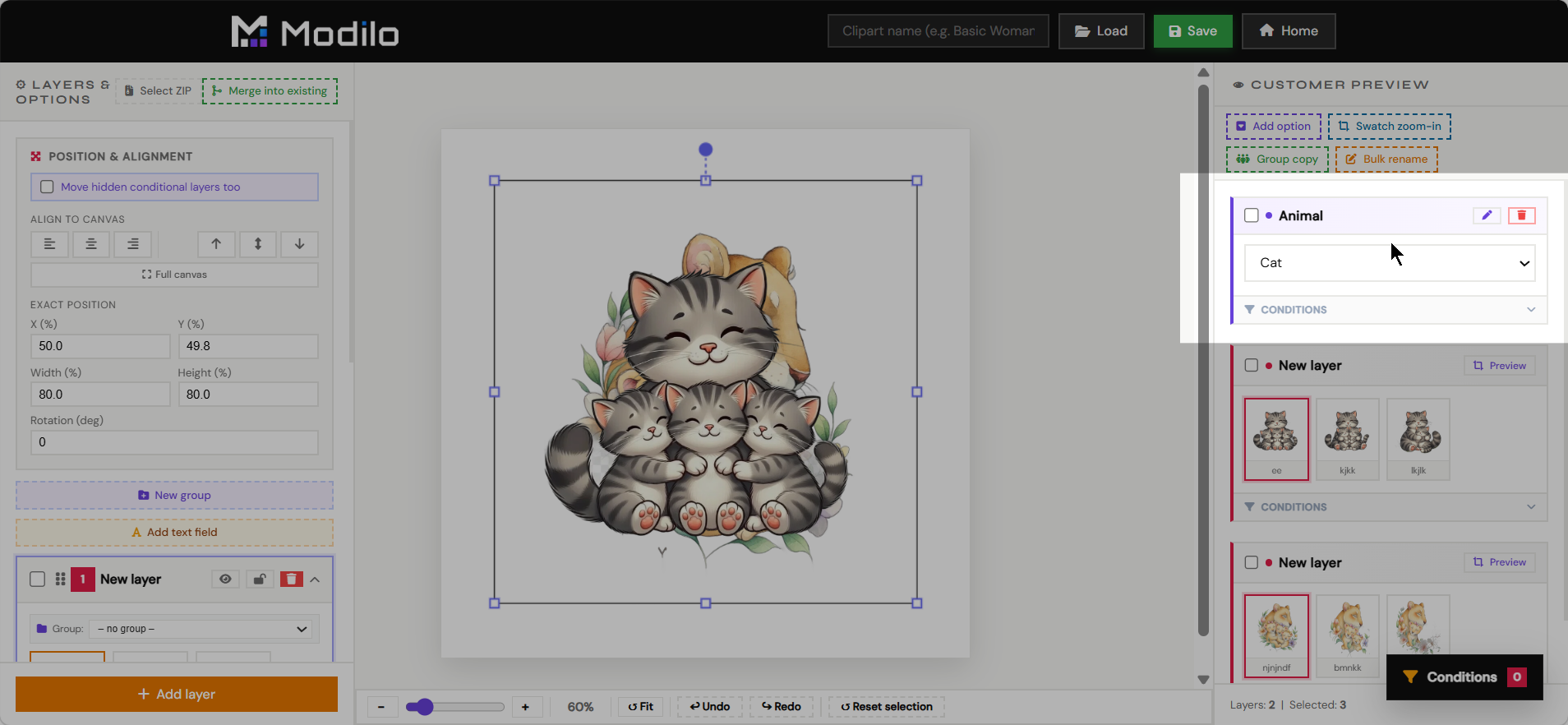
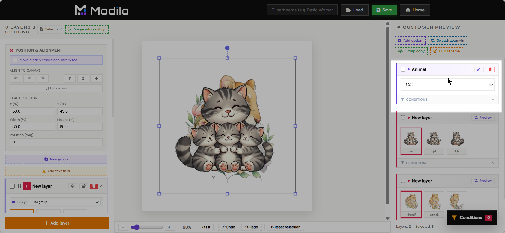
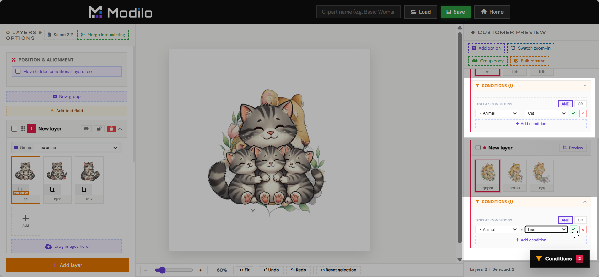
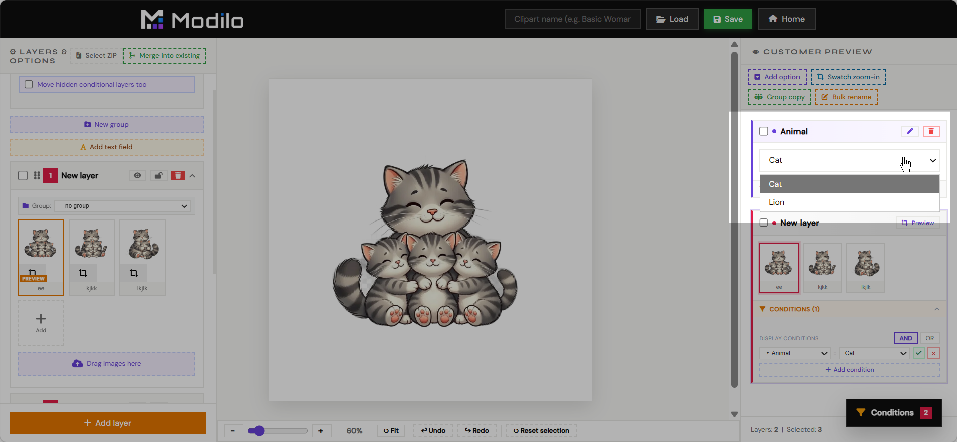
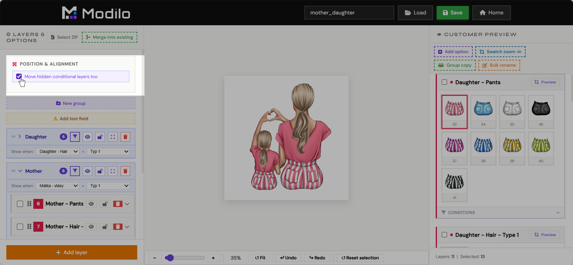
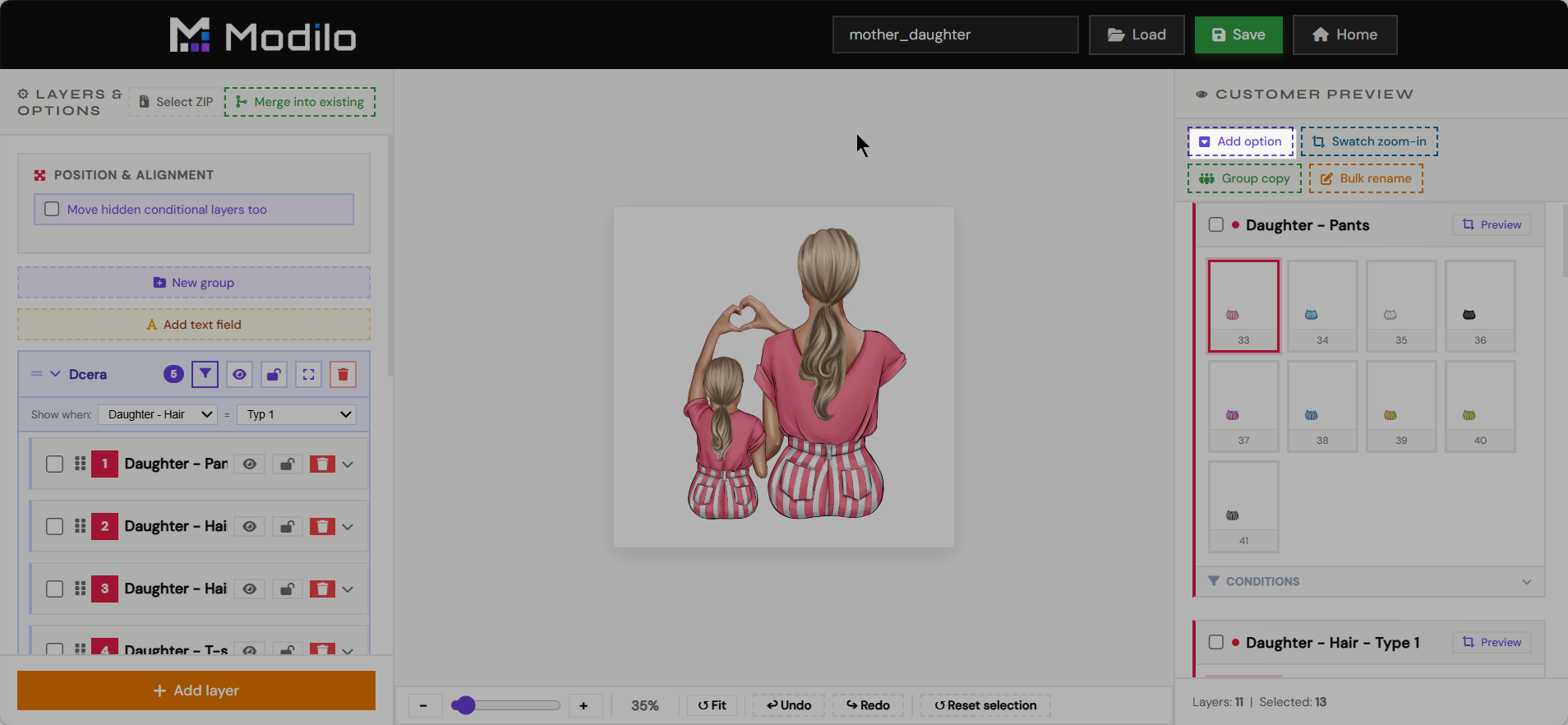
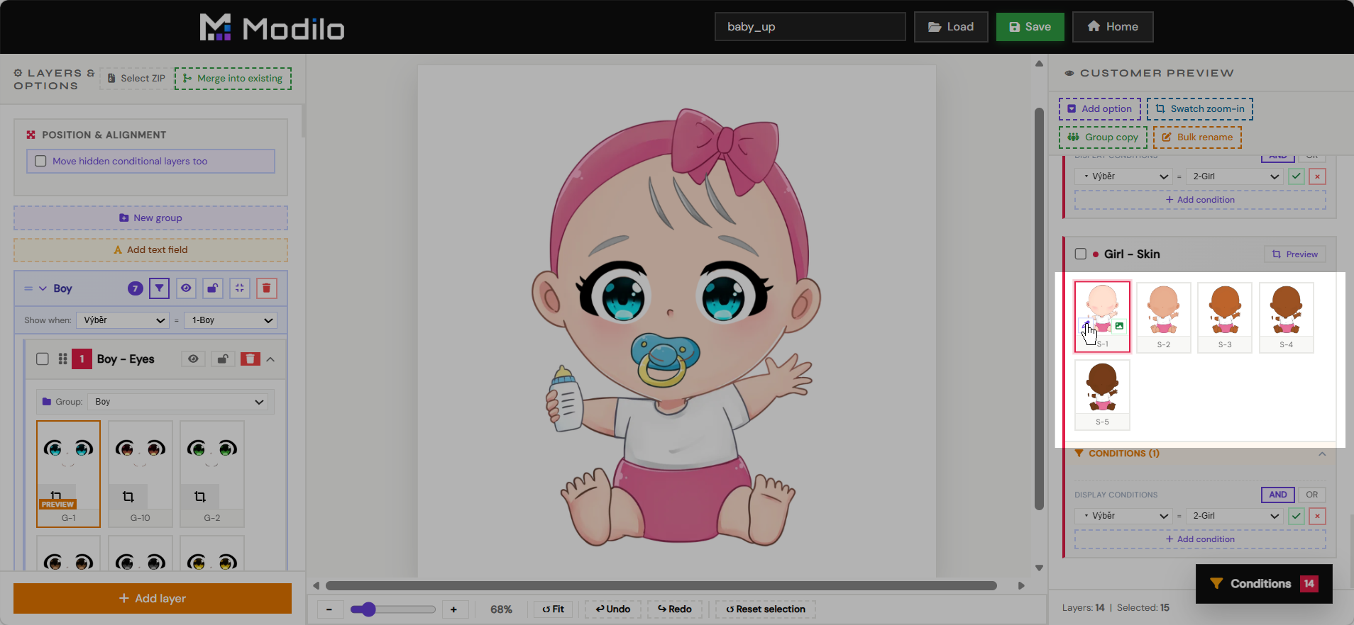
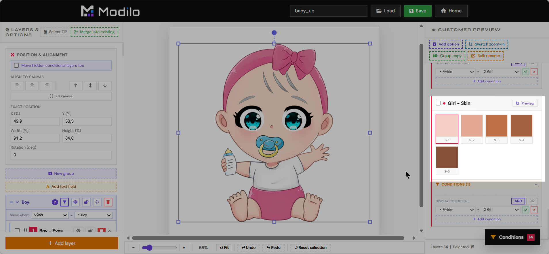
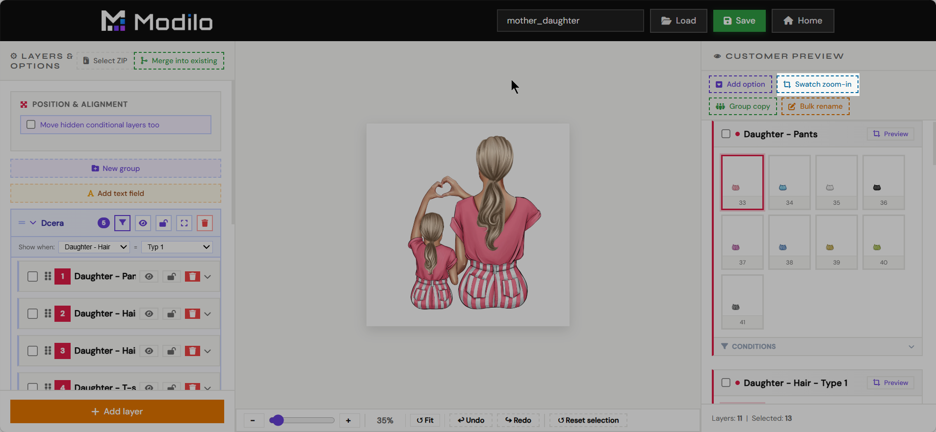
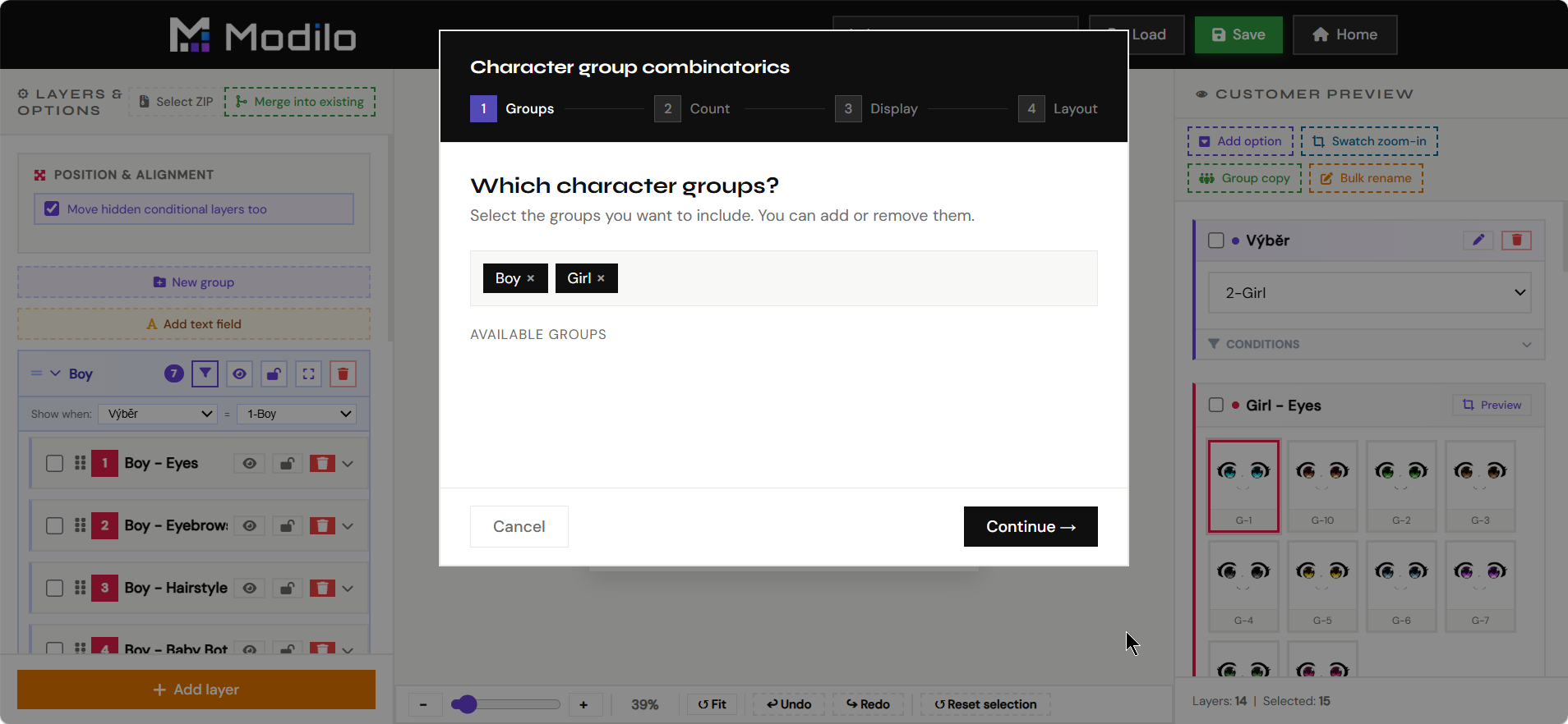
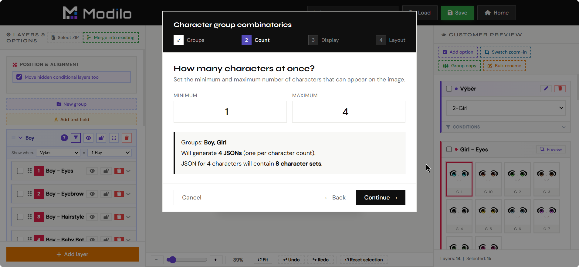
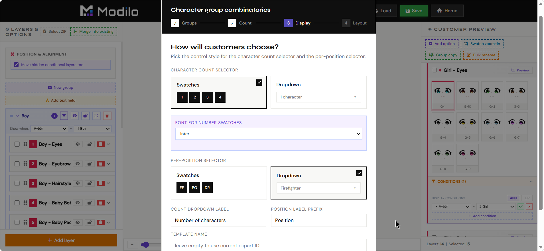
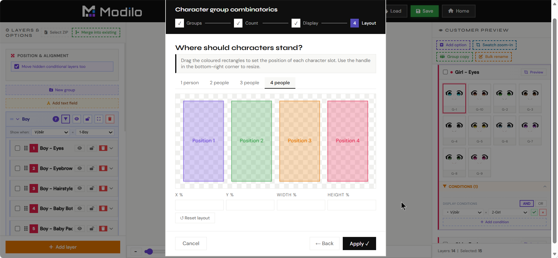
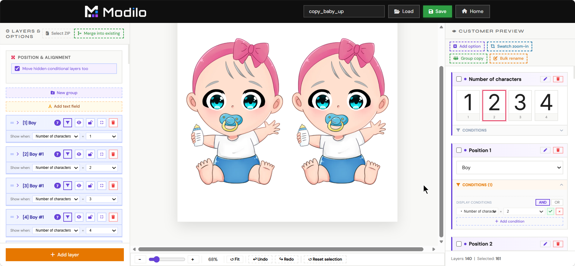
The Clipart Editor is used to build reusable layered illustration systems, such as characters, families, outfits, hairstyles, accessories, or scene builders.
- Create groups of selectable variants for customer-facing clipart products.
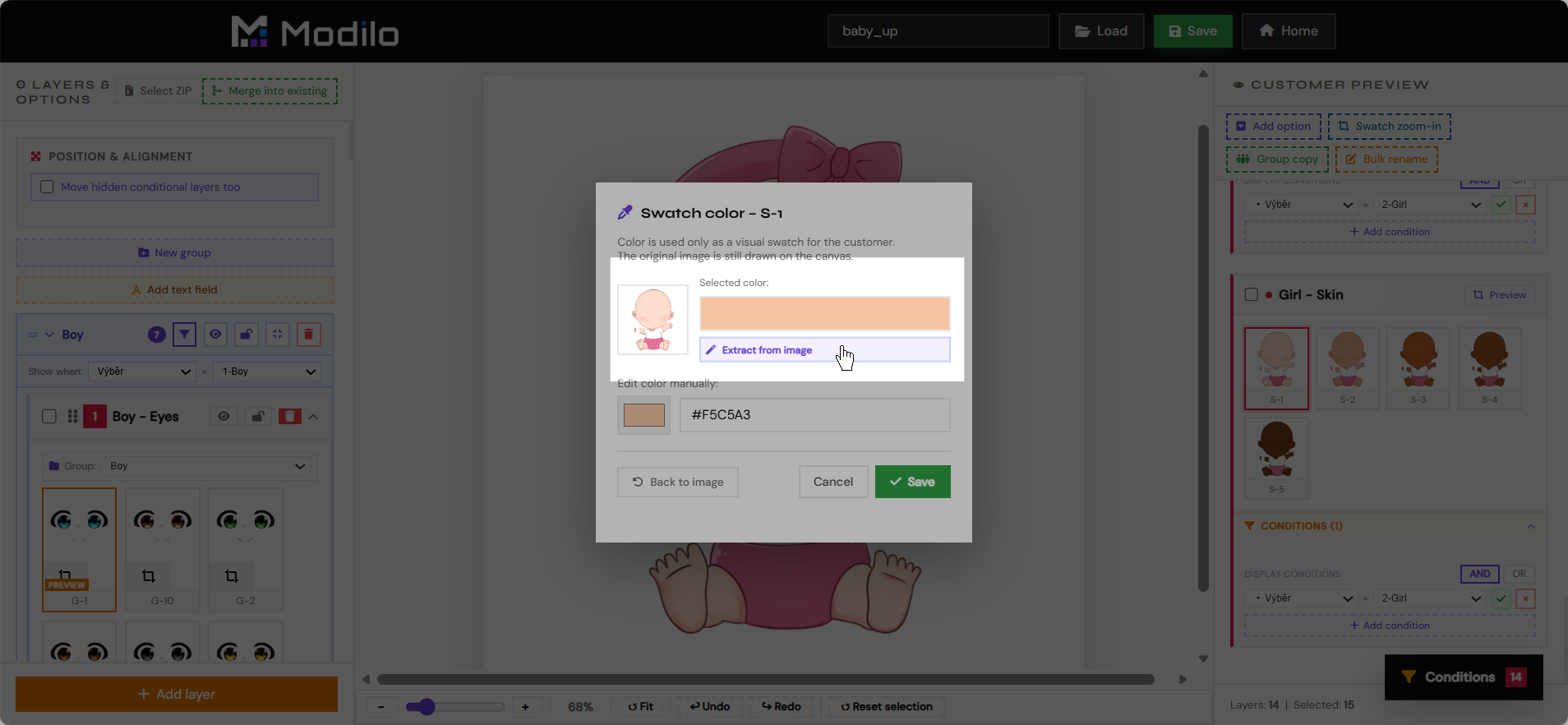
- Prepare swatches, nested options, conditional layers, and default selections.
- Reuse the finished clipart system inside the main Editor as an imported clipart module.
- Keep complex illustration products manageable without rebuilding the same artwork in every template.
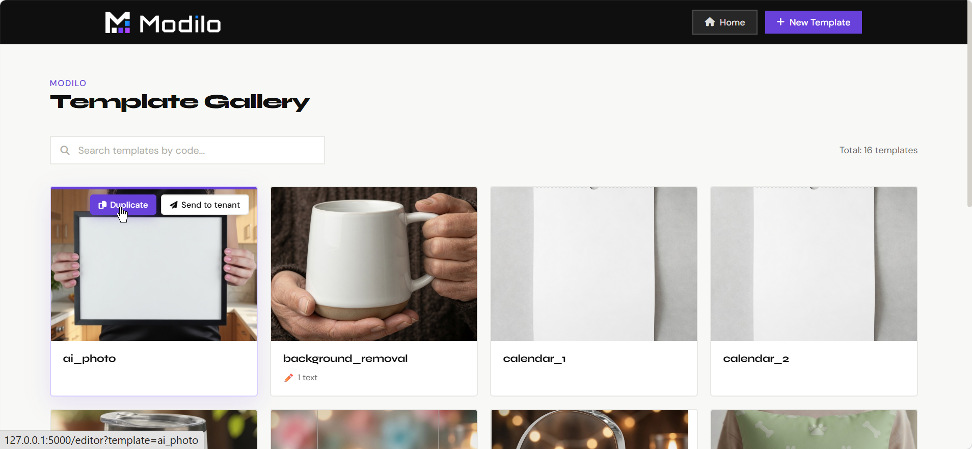
The Gallery shows saved templates and gives merchants a visual way to open, review, duplicate, or manage their existing template work.
- Browse saved templates without opening each one manually.
- Open a template back in the Editor for changes.
- Check which templates contain personalization fields.
- Use it as the main overview of merchant-created products.
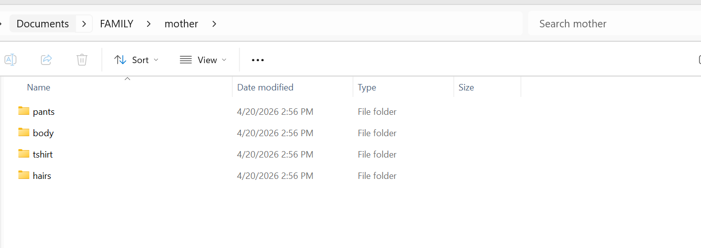
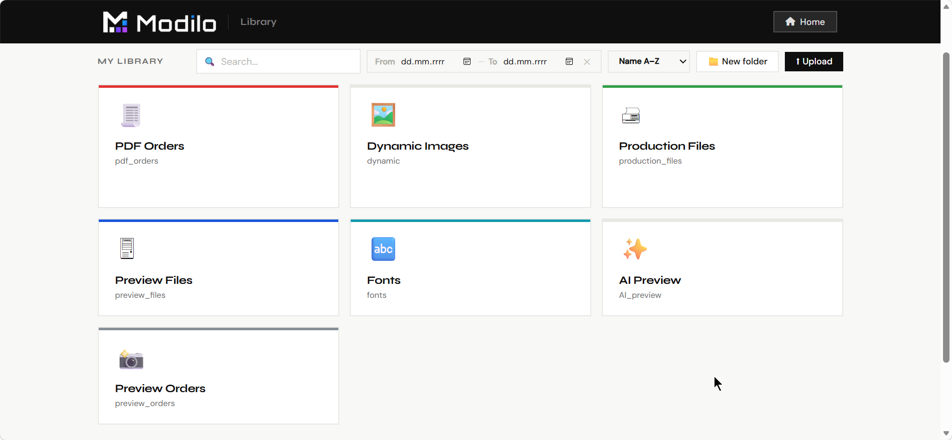
The Library is the file manager for design assets used by templates: print backgrounds, preview mockups, uploaded artwork, generated files, and other production resources.
- Upload and organize image files used by templates.
- Browse stored assets and folders.
- Keep reusable backgrounds, mockups, clipart, and design resources available for templates.
- Use it before template creation to prepare the files the Editor will reference.
PDF Generator
Manual production
The PDF Generator is used to render a selected template with personalization data into a final production PDF.
- Generate print files for testing or manual orders.
- Verify that text, photos, generated graphics, and dynamic choices render correctly outside the editor.
- Use it to troubleshoot templates before connecting them to real Shopify orders.
- Confirm that print dimensions, fonts, layers, and output quality are production-ready.
The Queue page shows background jobs that process customer orders and generate output files.
- Monitor pending, running, completed, or failed generation jobs.
- Check whether order rendering is moving normally.
- Spot stuck or failed jobs that need attention.
- Use it after launch to supervise production reliability.
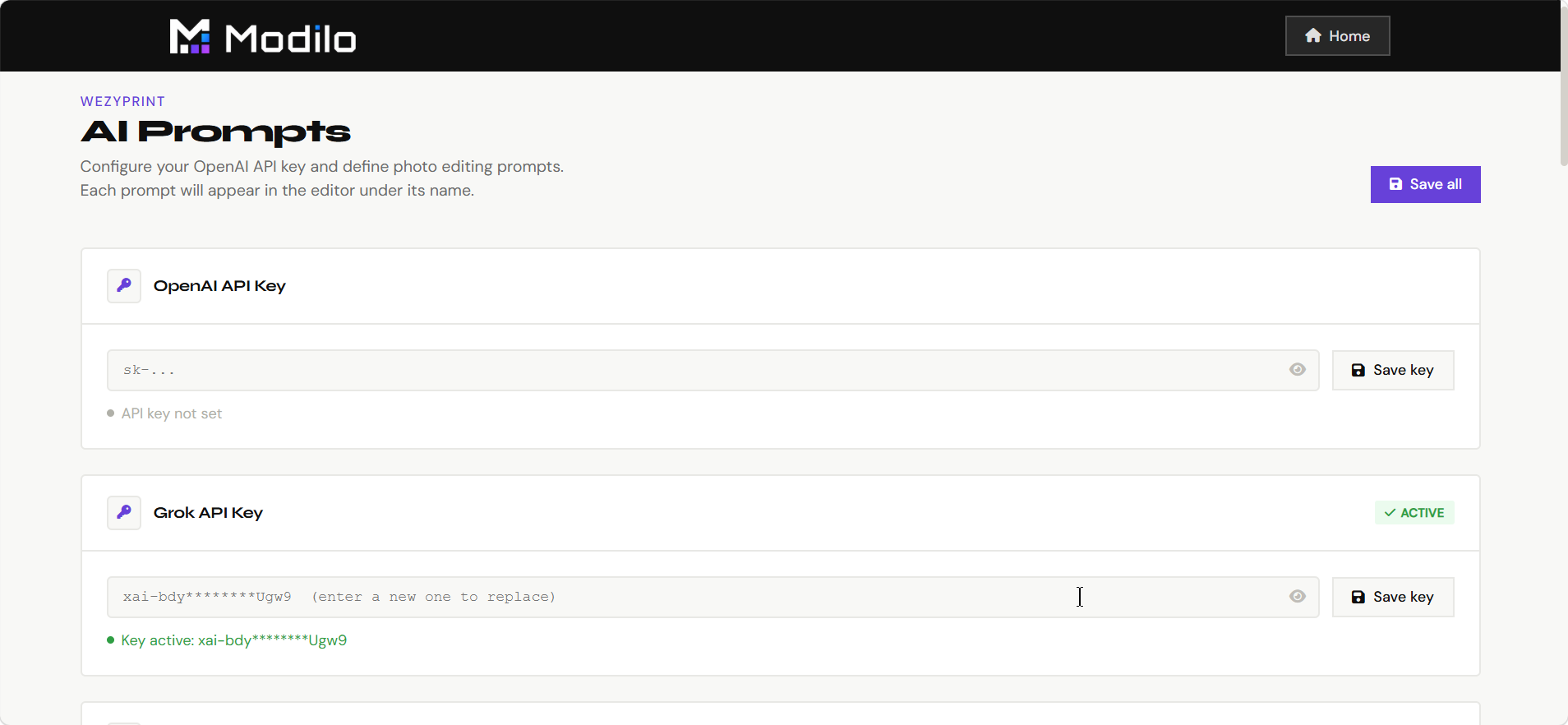
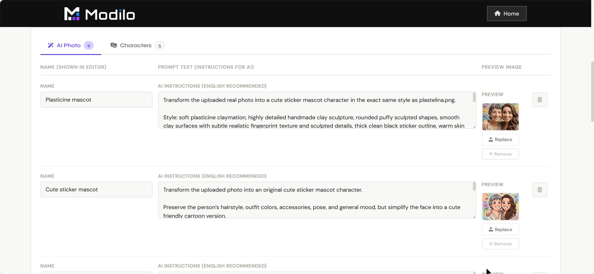
AI Settings
Prompt management
AI Settings manages the prompt presets used by AI photo and AI character modules.
- Create and edit AI transformation prompts.
- Organize styles such as cartoon, watercolor, oil painting, anime, studio portrait, or character generation.
- Control the merchant-approved styles customers can use.
- Keep prompt wording consistent across templates and products.
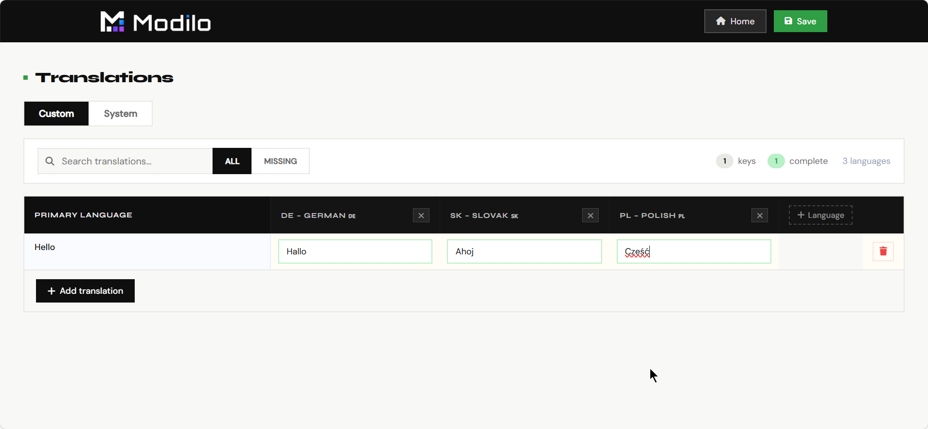
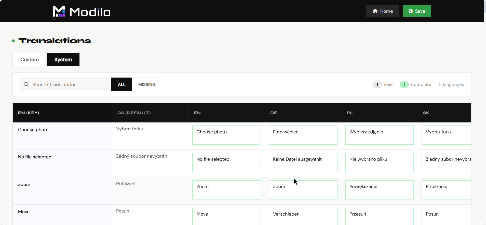
Translations
Storefront language
Translations controls the customer-facing wording used in the personalizer.
- Translate labels, buttons, messages, and validation text.
- Adapt the personalizer to the merchant's storefront language.
- Keep module UI consistent for international stores.
- Review wording before launch so customers understand every personalization step.
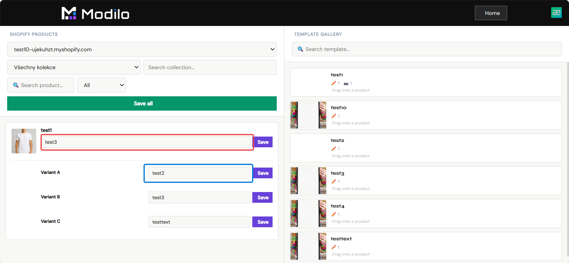
Shopify Sync
Product pairing
Shopify Sync connects Modilo templates to products in the merchant's Shopify store.
- Browse connected shops, collections, and products.
- Pair a Shopify product with the correct Modilo template.
- Store the template reference so the storefront personalizer loads on the product page.
- Use this page as the final step before publishing a personalized product.
Billing
Subscription and usage
Billing shows the commercial status of the merchant's app installation and usage-based billing setup.
- Check whether billing is active for the current tenant/shop.
- Start or review the billing flow when required.
- Confirm that the store is ready for production usage.
- Use it when diagnosing why a live store cannot process paid app usage.
Settings contains tenant-level configuration that affects how the application behaves for the merchant.
- Review store-level or tenant-level options.
- Configure behavior that should apply across templates.
- Use it during onboarding and when changing app-wide preferences.
- Keep setup values consistent before launching many products.
Editor Manual
Documentation
The Editor Manual is this documentation page. It explains the app, dashboard pages, concrete product workflows, and individual editor functions.
- Use it when onboarding merchants or internal team members.
- Check what each dashboard page is for.
- Open module details to understand what can be created in the main Editor.
- Keep it updated when new editor modules or dashboard pages are added.